Interviews with Artists
Holly Hendry
Interview by David McLeavy
Published October 2014
-
Holly Hendry’s work uses a sculptural language to investigate ideas of scale, space and weight. Hendry's often large scale sculptures envelope the audience and arrest them with their physicality.
-
Scale seems to be very important within your work. Why is it that your work is of such big scale?
My work employs and sometimes exploits the language of architecture and building so it is important that the work can use that level of scale, something much bigger than your body that is materially overwhelming. I usually combine that idea of function with something quite ridiculous. These techniques are used to draw attention to the functional aspects of the spaces that we use all the time, how these walls we build then become a sort of physical script that conditions the way we move and live. By physically interacting and intervening with these places I aim to draw attention to the places themselves.
Most of my work is quite site-specific as I usually use an aspect or feeling about a space as the starting point within my practice therefore the scale almost always seems to have to step up to that level in order to function and have that physical relationship with the site that I look for. The relationship between the materials used and the scale to which they are used is also important because I feel that delicacy and level of impermanence brings it away from being an object within the space or an overt statement about the monumental and more to do with that direct relationship with the architecture, becoming part of it in a way.
My final degree show work last year was a large, pink inflatable, that I made to fit the exact dimensions of the negative space that it sat within, that was then squashed against the architecture by an aluminium structure that supported it from beneath. The windows in the space were submerged by the inflatable and were left open, so from the outside of the building you could just see these strange pink bulges of membrane caused by the internal air pressure. In a broad sense, my work plays with these ideas of the inside and outside, and I feel when things become really big you can’t help but imagine the internal, even from your external viewpoint. I think on a larger scale the outside and the inside become quite tangible. I like that feeling of wandering round a big thing where you become very aware of yourself as a body or as an object because we like to forget that we’re objects.
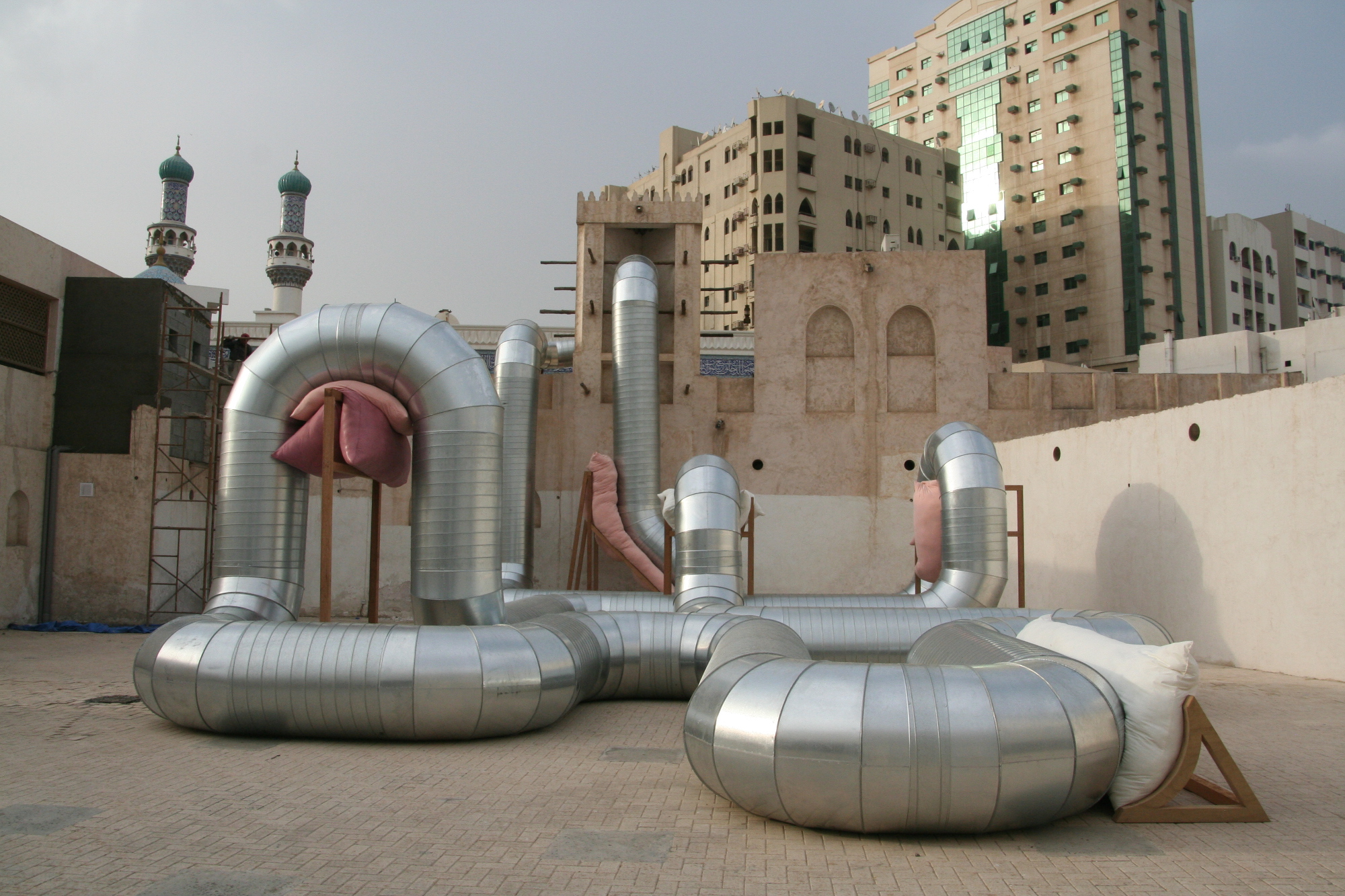
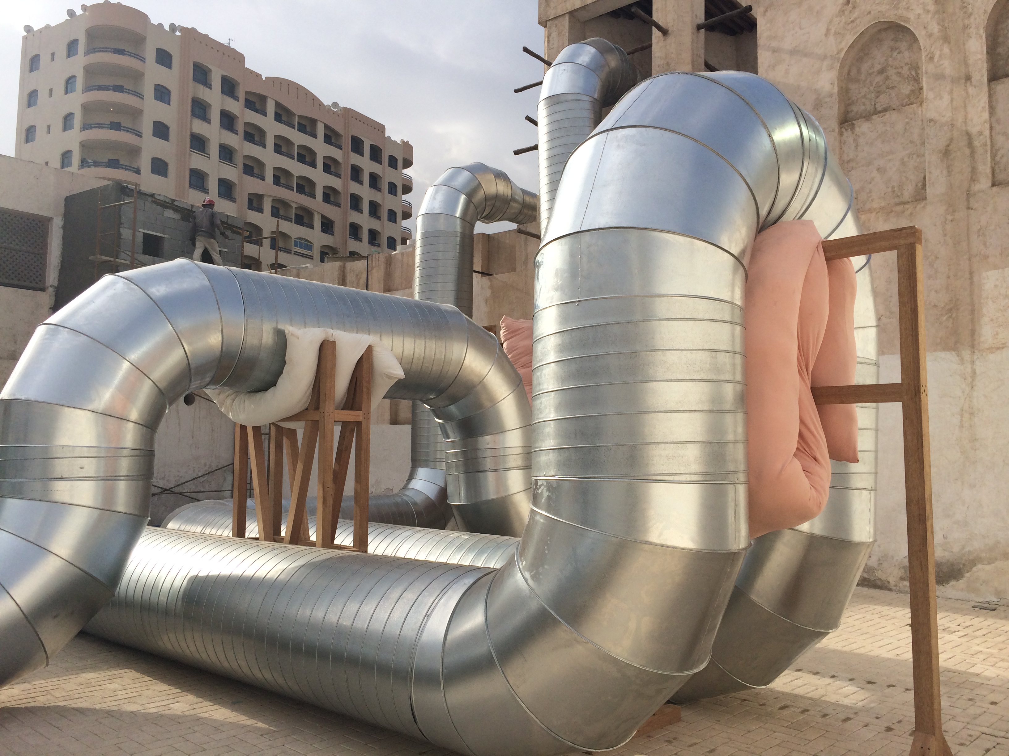
Homeostasis, galvanised steel ducting, meranti wood, cushions, fan, air, Courtyard C, Sharjah Art Foundation, United Arab Emirates, 2014
I am interested in what you mentioned about appreciating things that make you very aware of your surroundings and the architecture you find yourself in. Do you find that your more interested in working within spaces that have restrictions or spaces that are not intended to be permanent gallery spaces?
I like a mixture of both. Although I think there are always restrictions within spaces whether they are an intended gallery space or not, but the type of restriction and way people view the work changes depending on what sort of place it is. For example, I made a work called ‘Homeostasis’ in March of this year in Sharjah, in the United Arab Emirates. It was a site-specific work that was based within one of the courtyard spaces in the Sharjah Art Foundation. For me it was such an exciting opportunity to get to visit a new place and build a work based on somewhere in that place, and although the Art Foundation had gallery spaces as well, it seemed crazy to put work inside when the outside places were so visually and materially interesting. But then putting a work outside in the elements, in this courtyard that is used by a wide range of individuals, meant that I had to step up to this scale of space and consider the materials used, but also be very aware that was placing something is a public space that was going to be viewed by people who hadn’t necessarily chosen to view it. As a person coming from a different culture to build something within a rather public space, I thought long and hard about the effect of my work in this context. I knew that I did not want to make any kind of overt statement or comment through the work, and so my solution was to really work with the space itself as the installation medium. During my stay in Sharjah, I became fascinated with the history of the old wind towers or ‘Barjeel’ and their architectural forms and functions. This was the starting point for the work from which I used the shape and function of the space to determine its form. Once it was installed I really loved the way that people enjoyed walking around and through it, listening to the air that I ran through it as a continuous loop, kids playing on it, and enjoying the space in a way that they probably wouldn’t have done before. Saying this, I have just finished a series of works that are part of my solo show in Gallery North, a gallery that is very much a white cube space, with all the restrictions that gallery spaces come with. In a way I think I have found this more challenging than anything else, and as a result some of the works within the show are quite autonomous, which is pretty site specific in itself. I think the autonomy of the works is a slightly unconscious reaction to the space and my way of dealing with that. I showed in this gallery in June 2013, as part of a group show, (with the work ‘R:255 G:145 B:175 (II)’) and my way of dealing with it’s awkwardness then was to make the work to the dimensions of the size limits that we had been given for each work. For me, I guess it is important to play with the challenges of both. The gallery space is more of a blank canvas where the artworks are clear of other factors to an extent, and I’m excited about this relationship that they can start to have with each other. Other non-gallery spaces really excite me when there are conversations between what has existed before and what I have put there and the changing environmental effects – like seeing ‘Homeostasis’ at night, under moonlight, or in the more hazy morning light.
Homeostasis, galvanised steel ducting, meranti wood, cushions, fan, air, Courtyard C, Sharjah Art Foundation, United Arab Emirates, 2014
Your choice of titling is interesting. In your last answer you mentioned two works, Homeostasis and R:255 G:145 B:175 (II) and I was struck by the apparent difference in origin for their titles. Can you talk me through how you come about titling your work and how you feel it affects the way the work is viewed.
The idea of how much you tell someone is something I think about a lot, and for me, a title is always important in giving someone a way in to those extra things that are behind the work that you might not get from it visually or think about, otherwise. I usually title the work after it has been made, and hope that by that time there is a title in mind that seems to fit, and make sense with the physical work as well.
For example, before I made R:255 G:145 B:175 (II), I had become really fascinated with this specific tone of pink called Baker Miller Pink. It is a tone of pink also known as Schauss pink, after a scientist named Alexander Schauss, who discovered that this particular shade had the most profound effect on an individual’s emotions and hormones after staring at a card of the colour, lowering heart rate and respiration. He furthered the experiment by convincing directors of a Naval correctional institute (Baker and Miller) to paint some prison confinement cells this pink in order to determine the effects this might have on prisoners. Initial reports said that there were no incidents of erratic or hostile behaviour during the initial phase of confinement but later reports in later experiments said that prisoners had tried to scratch the paint off with their fingernails, so its quite a contentious colour in that respect. I liked the idea that this external colour can have such an effect on your internal workings and emotions and also its associations with the body from skin tones to porn (relating to the title of the earlier work Pink on the Inside), and so made sure that the latex that was part of the sculpture was this exact colour. It seemed to work with the idea of the installation in a larger sense, being this sort of giant bubble of tension held within the space but also something very tactile and seductive to the senses. So the title (R:255 G:145 B:175) is the RGB number of the colour for Baker Miller pink. When I’m unsure about something I usually Google it, and so if you Google that RGB reference you get lots of information about the colour, kind of like a little clue to something that’s not essential to the work but interesting to know as well. The work Colour Complement to Haemoglobin also addresses the function of colour in architectural interiors and the physical effects of institutional interiors, again using a specific colour that is worn on hospital scrubs to effectively highlight blood. I was interested in the way this colour functions but also its associations visually, that kind of sticky sickly toothpaste taste that you kind of imagine in your mouth when you see the colour; That notion of internal and external structures that I mentioned before; taste and vision, blood inside and blood on clothes.
In the same way, the title Homeostasis is a term that describes the stability of the human body's internal environment in response to changes in external conditions but is also commonly applied to automatic control systems. I wanted to use a technical term that described the deliberate failed ambitions of the work that contrasts the ridiculousness of an air conditioning system that just regurgitates air and only conditions itself. It’s interesting that both of the titles that you mentioned are quite different but both are pretty mechanical or technical titles, and I like that association, that brute technicality, in comparison to the absurdity of the works.
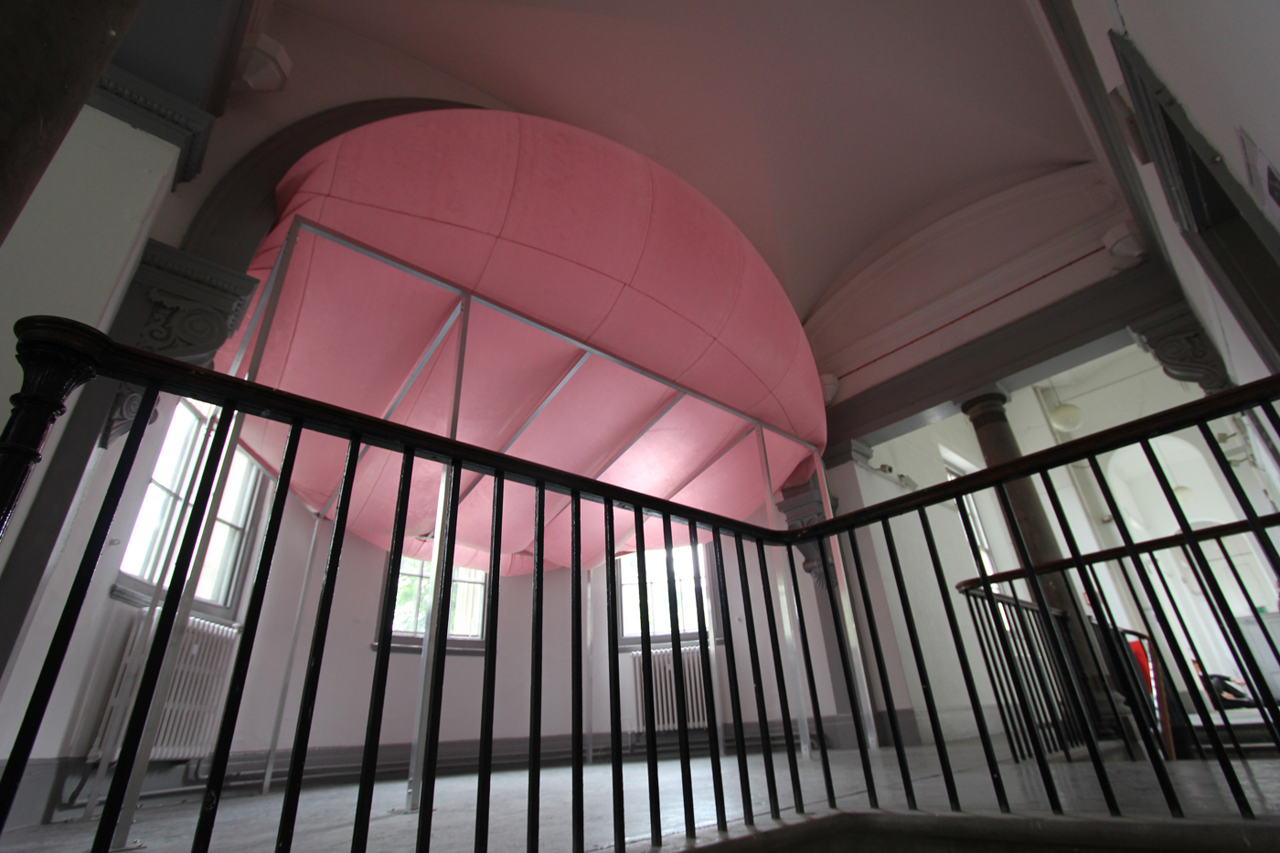
R:255 G:145 B:175, latex, air, aluminium, European oak, aluminium ducting, fan, bolts, 2013
You mentioned how certain works, specifically the pink works, have some initial relationship with pornography or the skin. Could you elaborate on that slightly and do you feel that this link allows a viewer a direct relationship with the work due to its familiarity?
Yes, I was previously talking about specific works and the very particular reasoning for the colours and tones used, but I like the more general association with the colour and what labels come attached to it in relation to the work. The work titled Pink on the Inside was another reference to the prison cells being painted but another reading of it could be related to pornography and terms like that, which relate to the female anatomy or sex. I think people’s immediate association with the colour conjures ideas of the female or girly-ness, which is interesting, especially in relation to architecture which is still a largely male dominated industry, but my intentions when I use the colour is mainly as a way of addressing our senses. These tones have familiar associations as you mentioned, and this allows a way into the work through visual association, but also hopefully through taste and touch as well. The work Take Good Care of My Baby is made from big chunks of plaster that are shaped like parts of an ancient column some of which are coloured in pinkish tones from pigment and baby lotion, which makes these objects start to resemble jelly or blemange or
something – and then suddenly something that could reference these slices of time, the history of building and these symbols of architecture also has a wobbly, sticky, absurd element to it.
I think this notion of touch or the desire of touch is very prominent in my thoughts, and something that I’ve been trying to work with recently, so I would hope that the pink works have a relationship with the skin in that sense, as well as materially being connected through the properties and the colour of the latex. When I was making those works I was trying to address architecture as this sort or second skin, or element that establishes relationships between the body and the habitat, and our position as things within that. I guess it was about working to these limits that shift from body to architecture, and the skin for me in a larger sense was a border and a connector at the same time.
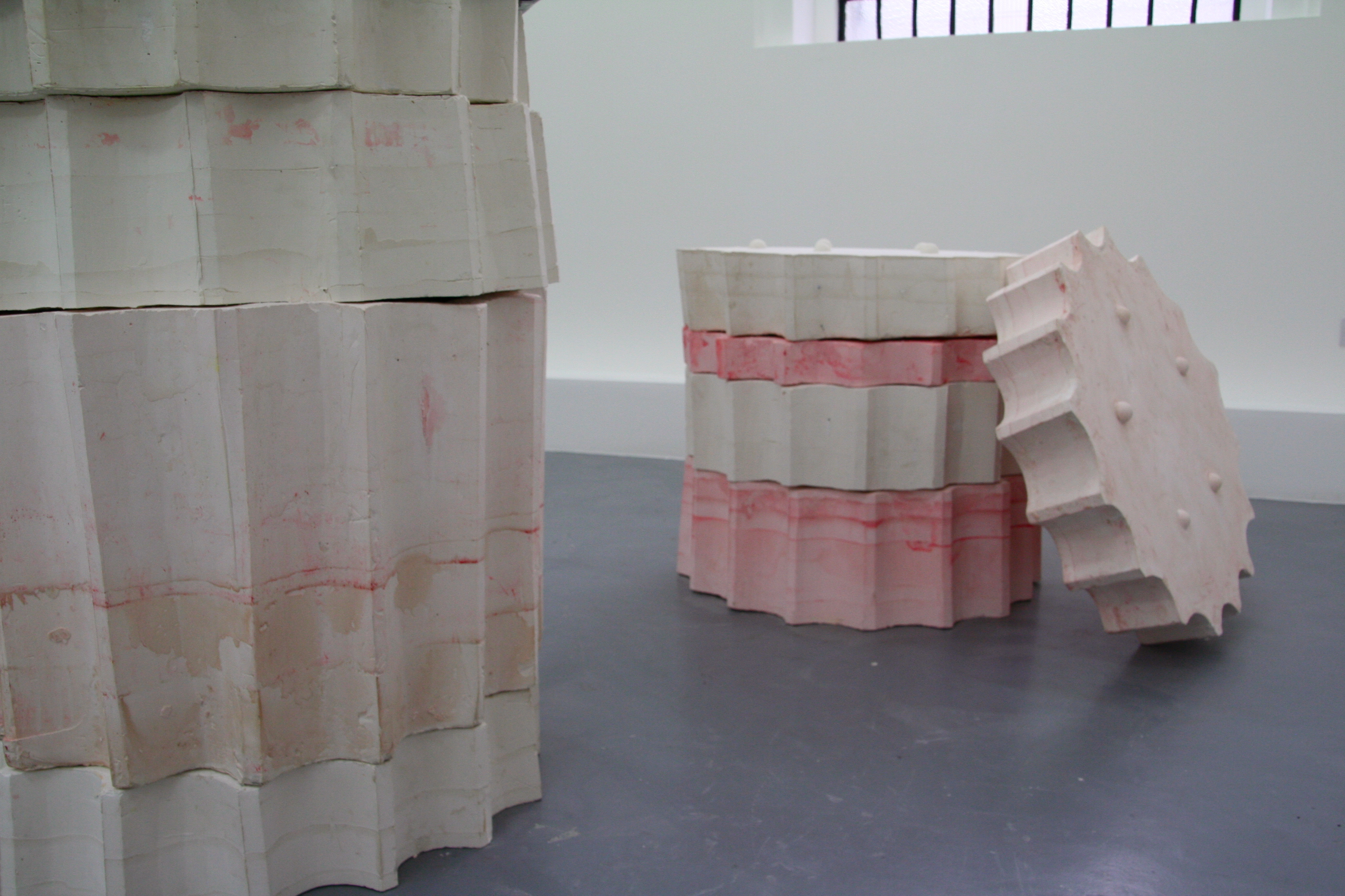
Take Good Care of my Baby, plaster, polystyrene, pigment, baby lotion, latex, varnish, 2014
You mentioned that pink is often associated with ‘girlyness’ and the feminine and I was wondering if you have ever experienced someone assuming that you make pink work as your a female? Do you think you would be making similar work if you were male and do you feel your gender plays a role at all in the creation of your work?
I don’t think that anyone has ever directly suggested that I make pink work because I’m female (or if they have they haven’t said it!) but it has come up in various conversations - the use of pink and the idea of femininity. I don’t believe my work is feminine, I’m not sure how an artwork can be feminine, but I think it is interesting to raise these issues of what we associate with certain colours or materials – how society can associate women or men with certain textures or colours or material properties and states – from buildings to furniture, to certain types of objects and how they are shaped. It’s human nature to relate the stuff we come into contact with, to other things we are familiar with, but if someone were to be so naïve as to just associate pink with the female, it would be a completely false and stereotypical idea.
I think that we all make work that relates to ourselves in one way or another, and so I make work as a woman making sculpture, so it would be totally different if I was male, just in the same way as it would be totally different if I had grown up somewhere else, or just if I was anyone else but myself. In that way my gender does play a role in the creation of my works, but in no way does that mean that any of my work is about my gender as such. People have found it amusing or interesting, that I make almost all of my work myself, perhaps because of the scale. For me that is such an important part of the process, to get an idea of the size in proportion to myself or the weight of something, the feel of it as a material to work on or with. And so the logistics of making something on a bigger scale is something that usually just requires planning, but I still think it is an odd aspect that crops up in discussions too which probably relates to me being female.

Pink On The Inside, timber, Baker-Miller pink paint, latex, air, sandbags, embossings on paper, 2013
I would like to follow on from what you mentioned in regards to making all of the work yourself. You talk of how it gives you a first hand sense of its physicality, could you expand on this a little more? As a side question have you ever found logistical and planning difficulties when working on a large scale and have found yourself scaling down certain works to get around these issues?
For me, there are some things that you can’t really know about unless you are physically engaged with the materials in that way, and this is such a vital part of my work, and working process, that makes producing the work myself fundamental in most cases. I find that some of the most interesting parts of my work turn out to be the parts that I haven’t planned. For example, I was recently working on these casts of inflatables where I had spent ages trying to work out a technique that allowed me to make a mould of them without totally ruining the shape. They are pretty large-scale and so I finally made up this weird casting technique using hard PU foam as the mould, which defied most of the rules of traditional casting. The mould’s size and shape meant that I had to get inside them to cast them, initially rubbing them with a release agent then a thin layer of plaster and then foam again, so the final result were these really fragile forms that resembled the inflatables, but also had these moments where the mould had weakened under the weight of the rest of the work – where they became kind of papery and revealed the delicacy of what otherwise looked like a dense and heavy form. There are also details in the plaster where you can see my finger marks from the casting process. These techniques became absolutely vital to the works as they were so derivative of their making methods; being formed from the inside out. If I had had the works fabricated, they would have perfectly resembled the inflatable’s, which was my initial intention, but I think an element of tension would have been totally lost. It would have also cost a lot more too!
Making my own work is really important for me as it not only widens my skill set, but also gives me the knowledge of a material or a working process, that will hopefully be really important in the future, perhaps when I get something fabricated, to know the specific qualities of a certain material, and what needs to be done to get the right effect. I had help installing and making the work Homeostasis, which I mentioned before, but for this specific piece the manufactured look of the piping was exactly what I needed therefore it made sense to use a standardised method like they would use to install ductwork on the exterior or interior of a building. Despite this, it was a really interesting experience for me, having the work go straight from drawings to the real thing, and having to step back at points and let others do things – for me, it gave the work an immediacy which was so bizarre in relation to the scale of the work.
In terms of logistical and planning difficulties, I have recently started using architectural modeling programs like Vektorworks and Sketchup, which have been extremely useful in planning works that are a larger scale. They allow me to calculate amounts of materials and be really precise about measurements, which becomes important on a functional and health and safety point of view at this scale. I found these drawing programs problematic at first as it felt like they forced me to make all the decisions while staring at a digital fabrication of the space instead of the true site, but I quickly learnt that they are totally vital if I am to work to that sort of scale. I think it is also interesting in relation to architecture, where I am sort of designing a work and then building it from those designs, but doing everything myself. Saying all of this, I had initially planned for the work called Entasis to sit on the exterior of Lewisham Art house, in between the columns. I had to go through lots of checks and made various drawings and plans to ensure that everything would work, but when it got to install the oak beam at the centre of the work was just too difficult to install vertically due to the sheer weight of the material and the stormy weather conditions that were happening at the time, as the work was outside. It became apparent that to install it properly I would have needed a crane and a large team of builders, so I re-thought the work and installed it leaning, in the gallery space. Although that was unplanned, the piece worked well inside and had a nice relationship with the space – but it was definitely an example of the difficulties with working on a large scale! So far I haven’t found myself scaling down works to get around these issues, because I think I would rather not make something, and wait for an appropriate opportunity to make it at a scale that works best, but I also think that you work to your capabilities and resources that you have, so maybe a change in space or facilities available would effect the work too.

The Hoarders and Wasters - Torso, 2014
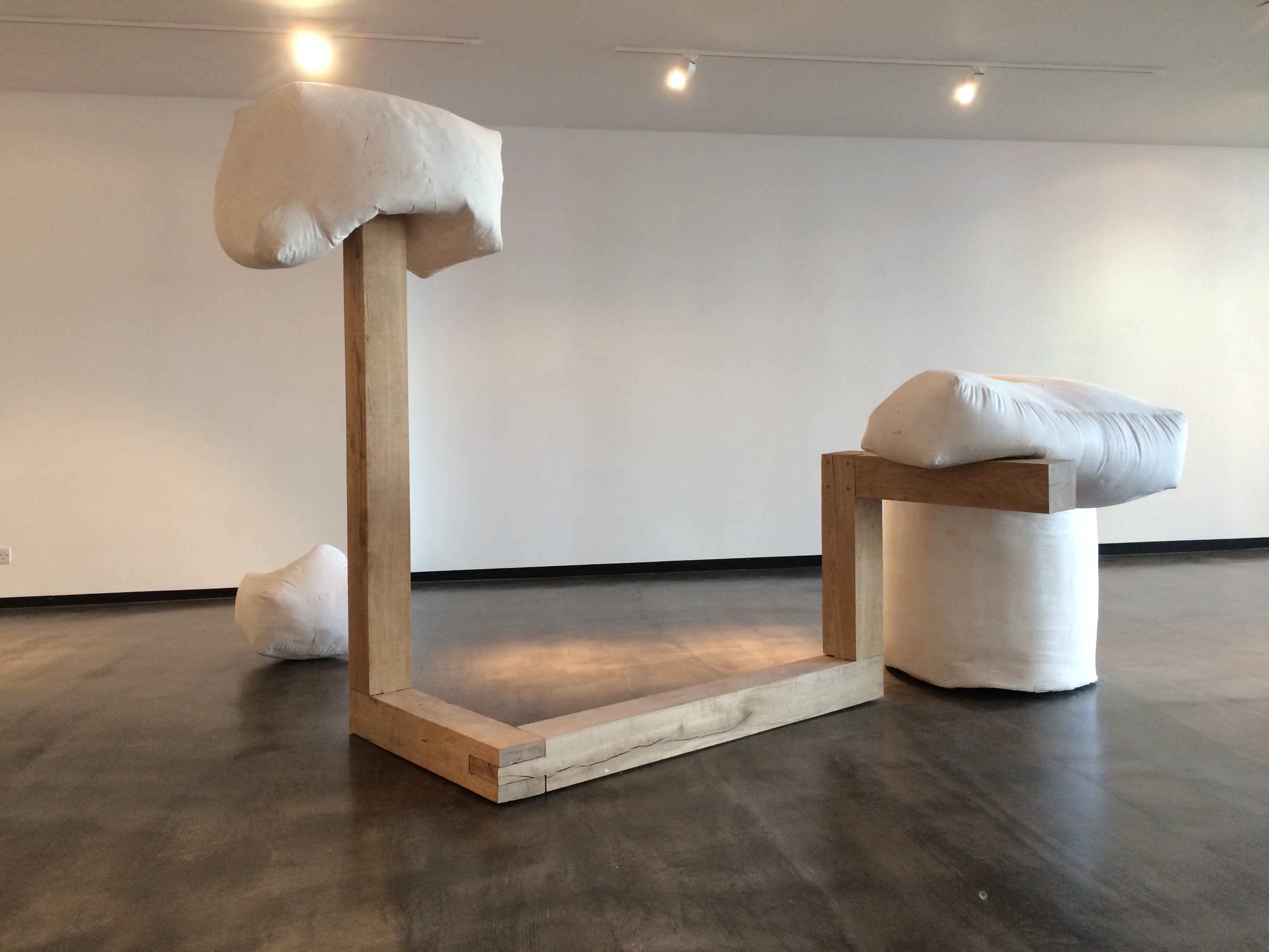
The Hoarders and Wasters - I Need You to Knead Me, 2014
So what’s next for you?
I have just installed my first solo show called Hollow Bodies, in Gallery North, Newcastle, which will be open until the 15th of October. I hope to re-install some of the works from the show in November/December in a really interesting space in Bethnal Green London, which will act as a sort of pop-up exhibition that will be open for a long weekend. I plan to also be part of an exhibition at S1 Artspace in Sheffield in December, called £1 FISH, in which each artist is limited to a budget of £1.
I have just begun a Master’s course too, in sculpture at the Royal College of Art, so I want to really get stuck into the course and take some time to research and develop ideas that have emerged from other recent work and shows.
-
Holly Hendry lives and works in London. Recent exhibitions have included Hollow Bodies, Gallery North, Newcastle, Putt Putt #2, Turf Projects, Croydon, The March Project, The Sharjah Foundation, Sharjah, United Arab Emirates and Vernissage, The Royal Standard, Liverpool.
If you like this why not read our interview with Josh Whitaker
-
© 2013 - 2018 YAC | Young Artists in Conversation ALL RIGHTS RESERVED