Sarah Roberts
Interview by Bex Massey
Published January 2016
-
What you will swiftly become aware of is her use of esculent language which oscillates between an ode and an haiku to materiality. If ever a professional technique is paralleled in one’s personal life this is it: She leans and caresses walls when tired, describes most things as ‘delicious’, and her installations create a visual poetry like few other. You will also notice that she often combines these landscapes with accompanying text which further punctuates but does not detract from the impact of the tactile collisions. Would you agree that these additional transcripts are paramount to your practice?
From hash tag haikus to material shopping lists and tactile babble- I use words at all stages of the research process, they record a place in as much sensory or visual detail as the sketches or photographs I take on site. I think of words similarly to my made objects, as material, chunks, colliding segments that make up larger sentences that reveal nothing much more than their own materiality. I love writers who sculpt with words, Maria Fusco, Lydia Davis, Miranda July, Heather Phillipson... Poetry is found in structure and phonics as much as suggested meaning, in fact as the meaning drops away in a string of babble we can better sense a base-tone, a sensation itself, in these compounded utterances, the word ‘blue’ has a capacity to bubble when you spit it out, whilst in a narrative it is a descriptive extra, the understudy to a grand known protagonist like THE sea or THE sky. When we notice these verbal elements so often used and materially overlooked -we find really beautiful matter in words.
My words are unruly though. They are not quite sure how to operate yet.
I think this is also where my interest in trying to develop soundscapes into the work originates from, I'm interested in the sound of something, of glass, of breeze, of steel, of ‘glinting’ or grinding beyond a recognition of the ‘thing’ that sound describes.
Context is hard. The reality of things always seems to be hard to read/hear or see properly - when I talk about crumbling seaside surfaces, people start to think nostalgia and ruin when what I really want to convey is not crumbling arcadias, and long gone donkey rides but the deliciousness of visceral surfaces, why have an explanation when you can have the sense of:
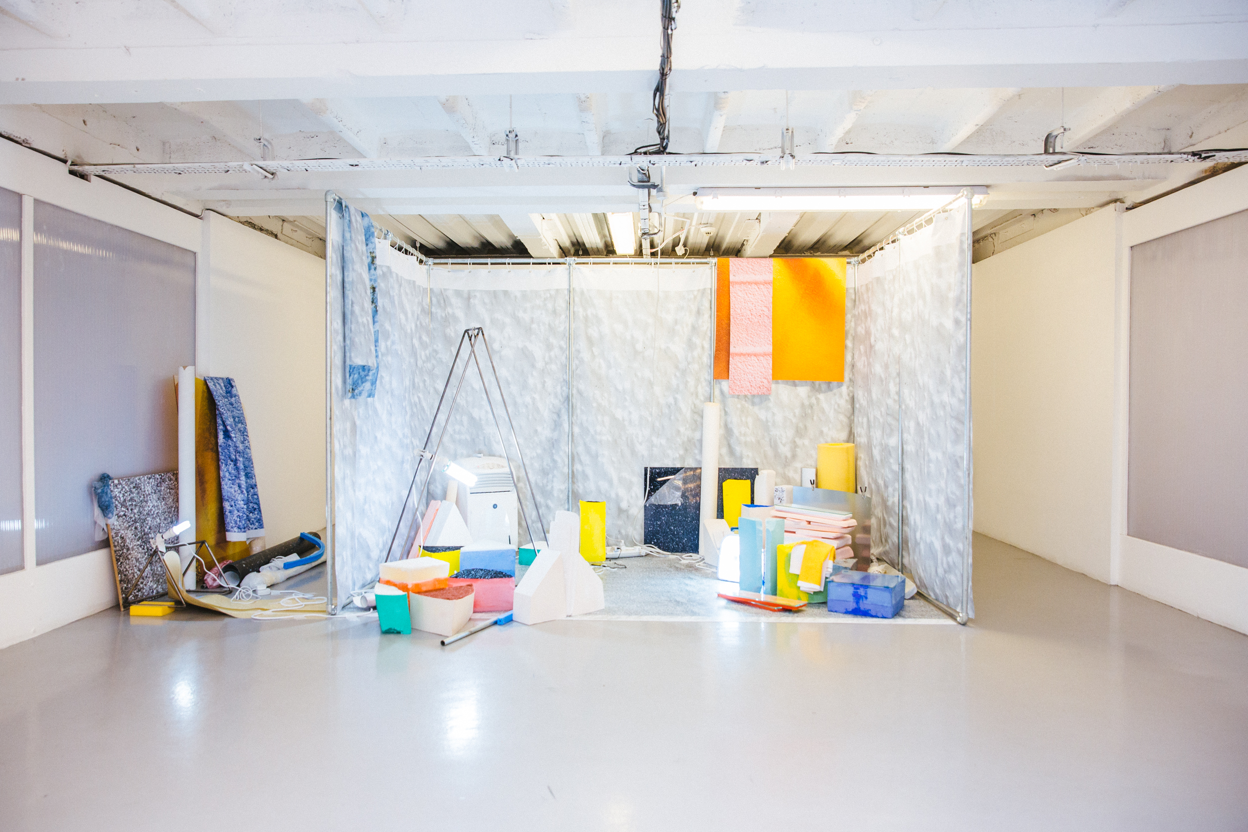
AMPERSANDS [Fairbourne a& Margate a&), 2015, mixed media with sound/ dimensions variable.
PC: Jenna Foxton & The Artist
Sea swell crashing and colliding on concrete edgelands,
These feet felt submersed in milled grains of rocks repeatedly ragged into sand
Under_water.
Bones in Toes- dipped in a swimming pool blue and dragged fleshy over tiles
Flared salty nostrils drawn widely open tasting the wind
Bungalow walls slipping into pink paste – swallowing… blancmange.
My world is not disappearing into a space of semiotics or a virtual reality, its quaking with vibrant matter and gasping flesh-tone-over-bone, so I don’t write catalogue texts, I write WORDS in no particular order.
Before I put the wordy queries aside- your titles incorporate much Cymraeg-does your Welsh heritage impact on any other areas of your practice?
For me Wales is a home and an unprecedented inspiration. I was brought up in a village that is basically a strip of houses couched between mountains and sea. When you are faced everyday with the epic it’s hard to not notice with intensity your material surroundings. When I’m back home in Snowdonia or drinking in the vast vistas of the Cambrian Coast It’s a world apart from the laughable idea that we exist in some hyperreal state. IPhones don’t even work here.
Jan Morris opens an astute study of the landscapes and lifestyles of Wales:
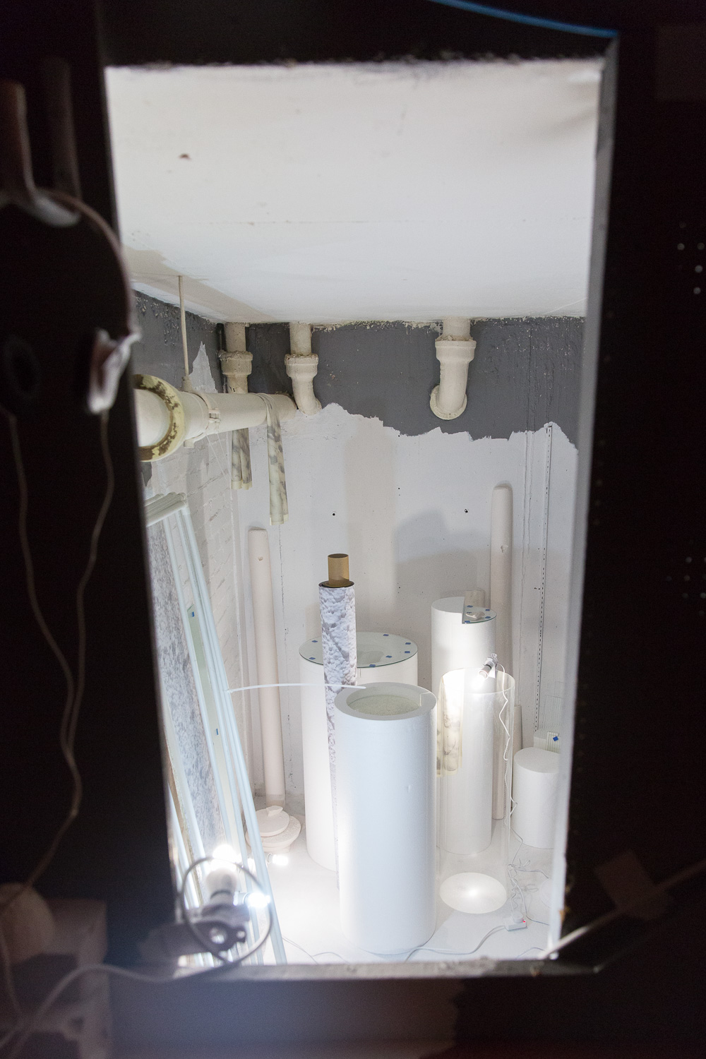
ETO? O Borth _AGAIN? From Borth [2014]
Mixed Media with Sound/ dimensions Variable
PC: Jenna Foxton & The Artist
‘To look at the nature of Wales is deceptive. Within its small expanse the style of terrain changes so often, the mountainous countryside is so constantly corrugated, this way and that, by ridges, valleys, lakes and passes, the sea appears so often, and so unexpectedly, at the ends of vistas or around the flanks of hills- the scene in short is so cunningly variegated that it sometimes seems not natural at all.’
[Jan Morris [1984] WALES: Epic views of a small country]
This is I suppose what I look for in other sites of immediacy when I go hunting for palettes. I hate medium, and beige has never been my colour. Suburbia scares me.
I don’t solely work with Wales as my material for making with and from. I had a similar feeling in America when I drove up from LA to Salt Lake City and back down again. From National Parks and Canyons to casino carpets and pastel condos it was a seductive assault of visuals - ripe for collecting and reverberating into something new.
I’m just looking to be surprised.
The Titles come quick and fast and are what they say on the tin. The use of Welsh-English translations is a further nod towards showing up the constructed-ness of a place names, or object titles, and sometimes I feel like a welsh word is more appropriate, it’s in my arsenal so I use it. Inevitably it gives a faux exoticism [despite an origin somewhere just west of the M1] and I don’t mind that. I think a lot of pressure is put on titles to perform, mine just say what they are or what they came from but strive to perform as an audible tool.

Shoeworld Triptych II
BLUE ROOM/YSTAFELL GLAS (BOW), 2015, mixed media with sound/ dimensions variable
PC: Peanut & The Artist
You talked briefly about the landscapes and palettes from around the globe that have impacted on your practice. Having seen you install your work and your general approach to surroundings on a day to day basis I also enjoy the manner in which you and your installations make me readdress veneers that I would otherwise negate: What is it about noting the unobserved that gives you kicks?
The thing I love the most about the facades of the landscapes and architectural spaces that I work with is their ability to slip-slide between painterly vistas, portraits or still life’s into an array of materials, forms and colours. I remember this one place called Jaywick on the South Coast, near BexHill where the coloured condos seemed initially to be showing off, covered in shamrocks and plastic sunflowers, but in the next breath they’re glooping into greens, or tasting chalklike as you imagine kneeling at knee height vanilla garden walls and licking them. I think this slippery space that straddles image and material reality is what I strive to recreate.
When people consider veneers, or the constructed nature of objects or fabrication there’s a lot of chatter about the fake, the repro, and a lingering taste of hyper-real and post Internet horror stories. Here veneers are posed as fragile, enmeshing facades of a bygone ‘real’ that came before the age of the computer and somewhere after the storm. For me veneers are reassuring, they have a sense of nowness, the surface is not a cover up- it’s a very real revelation.
Have you ever read ‘The Machine Stops’ by E.M Forster? The surface is the one thing we should trust!

Shoeworld Triptych III
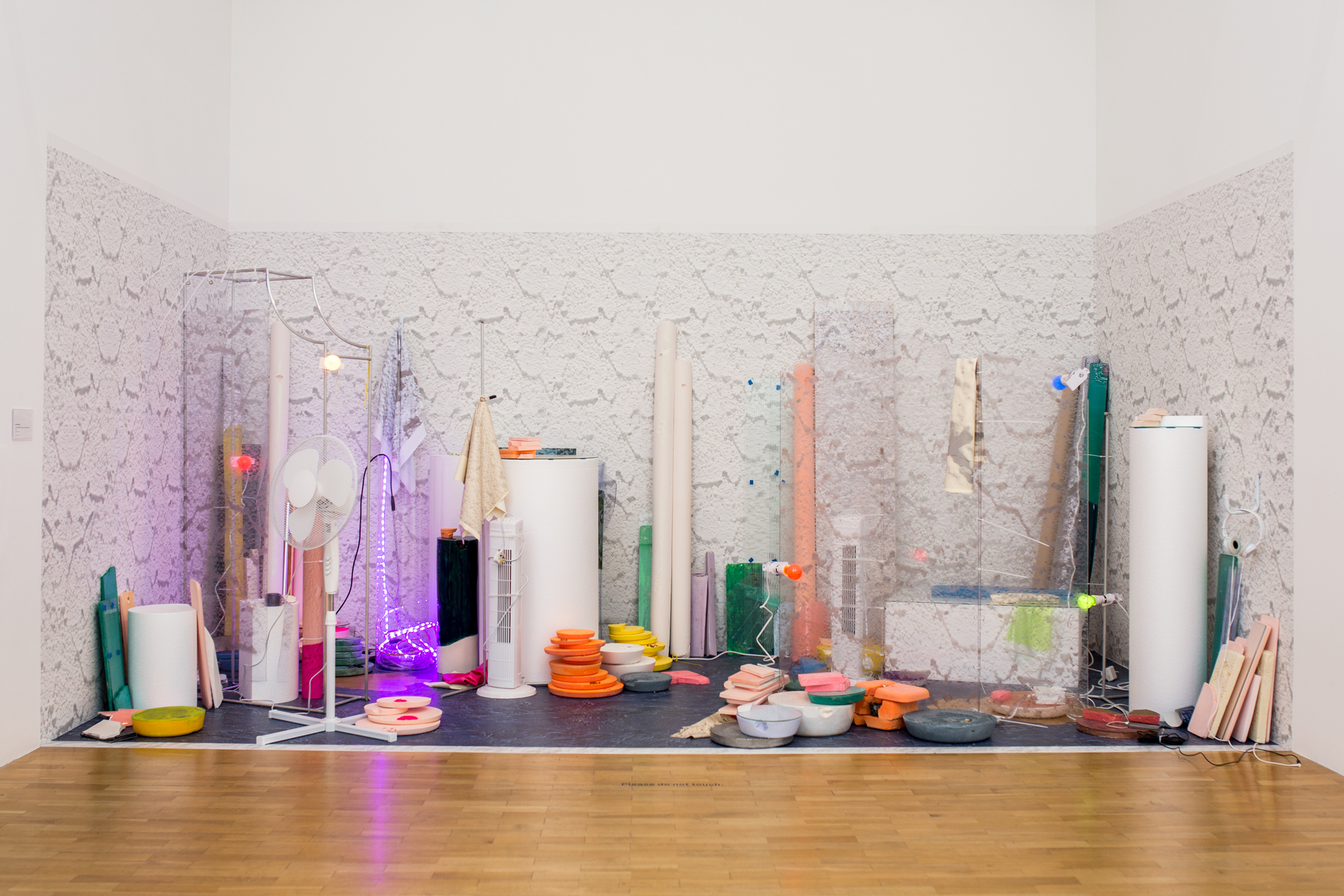
GWYN GWYNTOG/WHITE BREEZE (bloc), 2015, mixed media with sound/ dimensions variable.
PC: Peanut & The Artist
What comes first for you-palette or proposal? Could you talk a little about your methods when starting a new project?
It starts with the surfaces, I’ll end up somewhere I perceive as delicious. I’m attracted to places and objects where the surfaces have a heightened material visibility, this visibility comes mainly where form, colour or material is as explicit as the proposed construction/ function of whatever it is I’m looking at. So for me a beached bungalow in Barmouth becomes:
//RENDER//PLASTER//PINC//PEELING//BLANCMANGE//GLASS//STEEL//
I’ll move around places- be it a tiny welsh coastal village or a desert oasis- relentlessly taking photos of the surfaces close up, of the forms of buildings, of rocks, I'll sketch bollards or dolos, or a scrumpled carrier bag, or a pyramid of neon so I can remember forms I like.
I also write notes- maybe letters? - To myself to remind me of sensations and gestures, of glass glistening, or the sucking wetness of a pavement in the heat. I often move beyond the ordained boundaries of a place, observing its edges, its landed perspective, look at it’s position sitting in the wider landscape, seeing it from the outside as well as from within. Its probably no coincidence that most of my pieces are made with an intention that viewers may enter the installation or view from the created boundary line …
I take all this research back to the studio, where it collides with the materials of fine art, construction and whatever else I take a liking to that month. Here in this space of making, the palette gets remade, repeated into prints of forms.
Finally I consider the site of display, this informs the last phases of making and the decisions on how the piece will be constructed and how the viewer will access it as material or image.
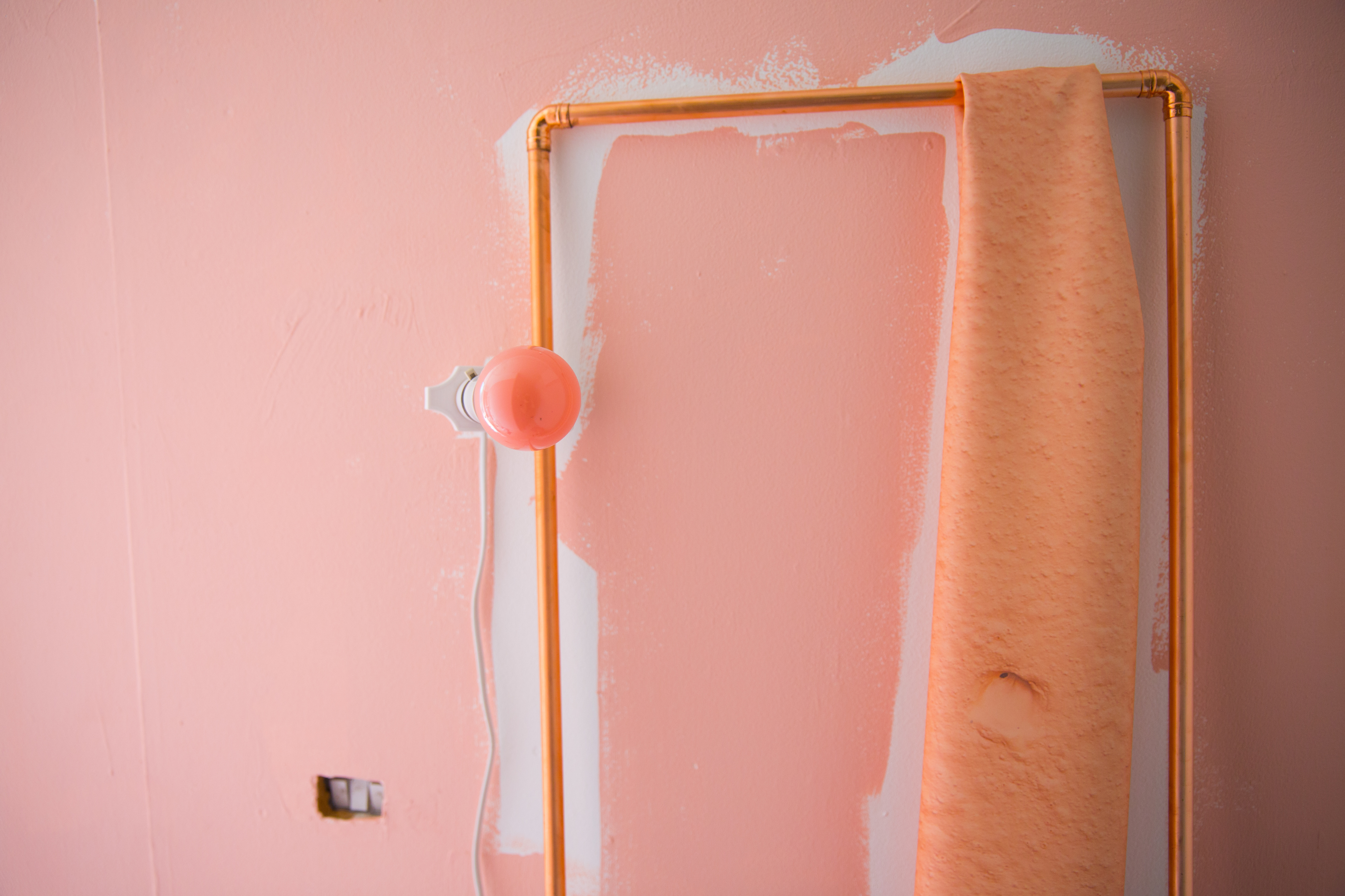
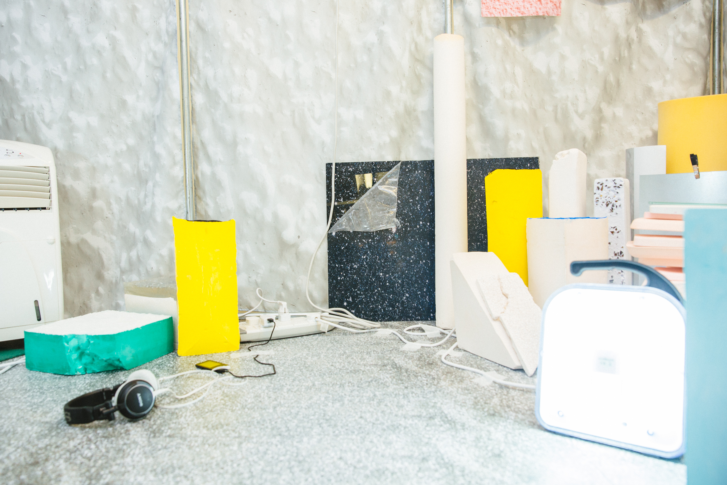
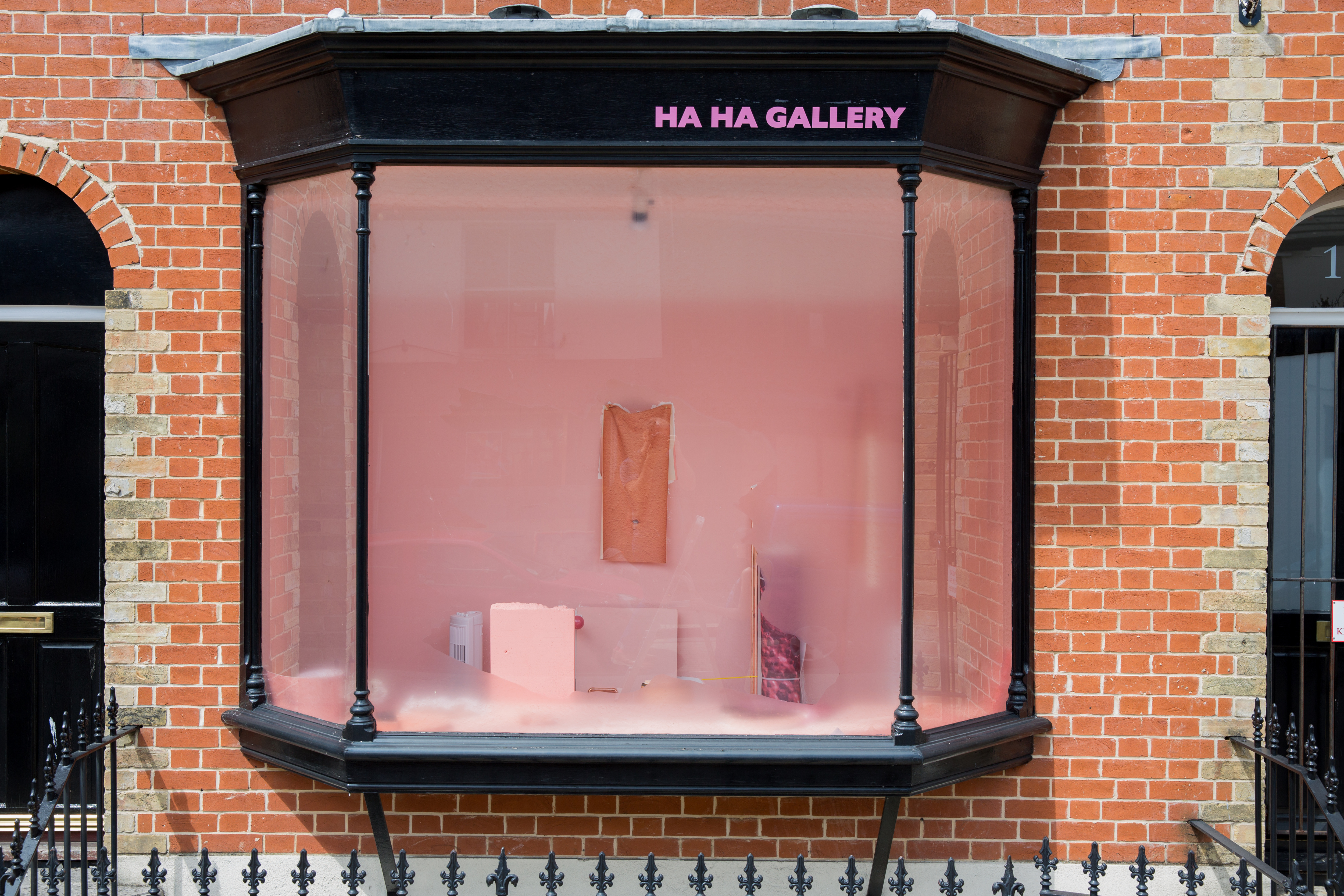
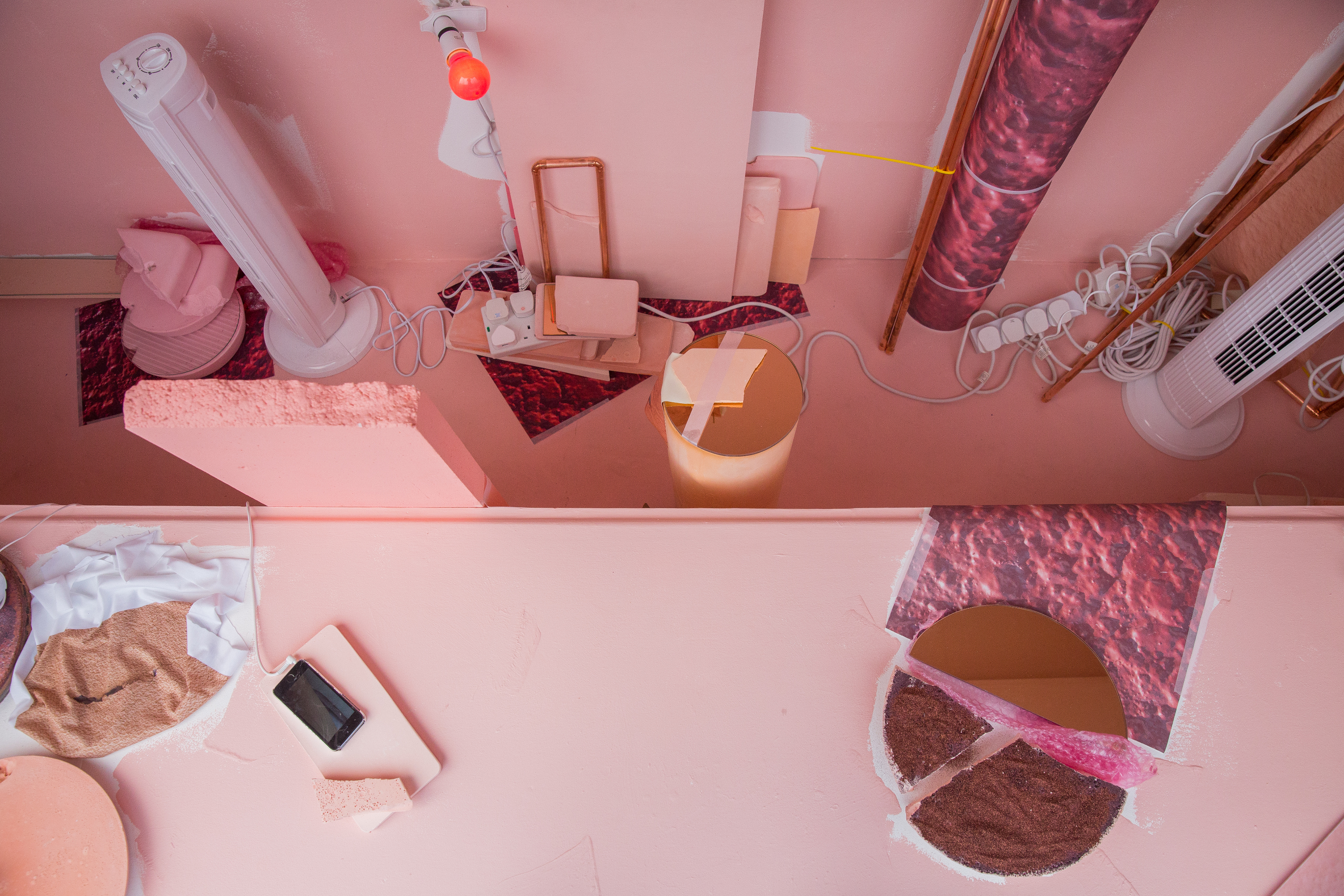
STRIBYN MOEL_NUDE STRIP (HaHa), 2015, mixed media with sound/ dimensions variable.
PC: Peanut & The Artist
Viewers of your site and exhibitions will be aware of your use of photography. In its most overt form this is noticeable as objects take on similar facades to their surroundings. Roberts is the queen of the jpeg for sure. What is not readily obvious is the manner in which she manipulates these images in reproducing them on convergent substrates. A perfect example of this digital alchemy can be seen in GWYN Gwyntog / White Breeze (Bloc), 2015. This installation crept out of the dingy dark damp depths of Shoeworld like a resounding echo of light. The poetry here was mesmeric and the multivalence of her subject continued as you walked into its epicentre and were confronted with materials copying their counterparts: A piece of OSB dressed in the likeness of a piece of Perspex that leant nearby. And mind explosion. What is it about manipulating materials and altering the manner in which we perceive the substrate that you enjoy? Do you care that we notice the overlap/new surface at all?
When I take photographs on site I feel I’m more of a human scanner than a photographer. I take close up photos of walls and floors and then later stitch together the images to recreate these bumpy, lumpy esculent material facades in a new setting, I think of it like collecting, literally peeling off the walls so I can smooth them over some new substrate.
My end game is to invite others to look at surface as I do, sometimes this layering of materials in image and substrates for printing on can make you observe more closely the facades we’re faced with and what they are made of. As you observe an image of texture you perhaps notice it’s tactility even more than you would in a material reality. And maybe even start to think about the image as a tangible thing in itself – ink pasted onto matter - when it’s presented in this way an image of materiality or the materiality of image both feel very real and present.
But then there’s also the joy, of snatching up walls in an iPhone or a camera, and looking at the colours and textures like a Dulux colour chart. Totally delicious. You should see my holiday snaps, my slideshows would be a riveting display of Costa Brava Renders!
And not to be flippant but I really don’t mind what you notice, it should be there as an excess, fluctuating between image and material with no one thing more important or illuminating than the other, ripe for a new viewer. I like that the things fluctuate between print and material, object and image- it allows for a range of material experiences.
I would imagine that these are lengthy and expensive processes that you are using-why then do you almost hide these aspects or make them so subtle that they can be oft missed? What is it about the digital that draws you to representing them in this manner? When did your love affair with vinyl start?
Everything I do when researching is done with a certain amount of immediacy, its about a rapid looking and breathing in of spaces. SO when I get back to the studio there is a certain delicious irony to spending hours painstakingly stitching together yards of a digital image that to everyone else just looks super basic. Its always a real remake- but sometimes I’ll move around portions of the image or play with scale to add depth, to shift perspective – I guess to make the sensation more true to what I saw in it - whilst keeping things firmly rooted in the colours and material of the actuality of that surface I found.
I seem to have a fear of developing too much skill, although I relish utilising the skills of others- those who work in mass production foundries, printers who supply visual merchandisers, glass cutters who make everyday windows [which are btw often spectacular]. Then I do what we all do with these amazing expensive and worked materials – I throw them in a mix. Just like a leaded glass window or an ornate fireplace slips into an interior and becomes functional, I throw it all in together, but in the hope that in the absence of ‘object memory’ [as it is not an actual remake but rather a repetition into a new form] that each thing will remain to a degree a material, with a capacity for flux.
As for the vinyl- my first full scale vinyl was the one I used in ‘O BORTH-From Borth’ [2104] the installation I showed at my degree show. I like vinyl’s ability to cling to a space and also separate itself from it visually, to disappear into a floor or wall, to make sections of the room almost ‘drop out’. Once the shells are in I feel like I’m in a space aside from the gallery and the act of introducing objects to this shell starts to make total sense, its like drawing out a landscape, or the contours of a nude.
I had used vinyl since my foundation course though, but in smaller scale and in borrowed patterns. I brought 26 rolls of it back from Lanzarote once, in marble and gold- amazing. In my studio I used to cover all the desks and lockers with vinyl so I could change my environment depending on my palette. I love how it can allow a surface to slip into a colour or a space or a form and then back again- into locker doors and table tops.
Have or would you ever try to recreate these techniques through another medium-say paint?
I’m really interested in paint. Some recent works Absent Nude// Croen Absennol’ 2015 //Bare Strip/Stribyn Moel [HaHa] 2015 //and my most recent Shoeworld Triptych 2015, all use paint as the shell of the installation.
In the nude series the paint is used as a shell but is also ruptured, paint draws around objects demonstrating it’s equivalence to the objects placed upon it or in front of it, it reveals its position on the wall as a surface, a layer, a material. In the landscapes [Shoeworld] it mirrors its counterpart objects, undermines and reinforces and marks out its terrain on the architecture onto which it’s pasted. These painted pieces all hark back to a piece I made in my second year of my BA, called ‘Porcelain Desert’ 2013, it was an all white piece that seemed to operate as installation and image…I think that was a real turning point in my practice.
There’s a freeing sense of looseness about the paint works, their collision with space feels more deliberate AND unexpected. The fact that they require less planning and are a direct response between my hand and the wall is great, I sketch out an outline and then daub the paint, like cross between a bad DIY job and an abstract acrylic, in the same way that I place the objects, its not really planned out, its just a response to that space and what feels right during install. I love the immediacy of these sketches.
One of my favourite aspects of your work is how immersive they are. How they engage all my senses and momentarily enable me to concentrate on details rather than deadlines.
Each installation seems to document a moment, a material, a meaning. Would you agree that your practice touches upon archive in areas and how important do you feel your soundscapes are in achieving this?
Yes, I suppose I am documenting places – my archive comprises words, sound bites, surfaces, scents, a chronology of technology objects as well as all the images and sketches, there is a real sense of collecting or foraging in the research. I’m snatching the things I notice on face value that make me consider the wider space around me as a body. It’s an aesthetic archive but yes it has depth, and this is where the immersive experience comes in.
The sound is another way of drawing, I collect up soundbites then compose them into what feels like an aural space – I think of each soundbite sketching an area, moving in pano from ear to ear and travelling up walls and into gullets, guts and ear holes.
-
Sarah Roberts lives and works in London and Mid Wales. Recent exhibitions include The Secret Lives of Shoes as part of PH Residency, Shoeworld, London; The London Open 2015, Whitechapel Gallery, London; Treat Yo Self [curated by (it’s all) Tropical], Bloc Projects, Sheffield ; I’m so excited, Haha Gallery, Southampton;
Roberts completed her BA in Fine Art at Chelsea College of art in 2014. She is currently part of the 2015/16 Into The Wild Residency Programme, Chisenhale, London. She was selected for ACAVA /ArtQuest Lifeboat residency 2014/15; The Parasol Unit Exposure Award 2014, and was a Shortlisted artist in Saatchi New Sensations, London, 2014.
www.sarahrobertsfineart.co.uk
-
If you like this why not read our interview with Bex Massey
-
© 2013 - 2018 YAC | Young Artists in Conversation ALL RIGHTS RESERVED