Interviews with Artists
Daria Gitmanovich
Interview by Doug Bowen
-
Published in May 2022
-
Let’s begin by discussing your process and gathering of content for your work. How and where do you come by it? Who are the people you paint?
My paintings are inspired by elusive moments from the everyday life that surrounds me. It can be a passage from a song or a melody, a postcard of Botticelli's 'Primavera' taped to the wall with neon orange tape about to fall on a palette of wet oil paint, a memory of a field of flowers from my childhood, black Asics trainers, a book by designer Raf Simmons 'the fourth sex' uncovered on a random page. These fragments can suddenly emerge as colour, shape or as space itself.
My work process is really intuitive. Sometimes I have a clear idea of what I want to translate in a painting and sometimes I have to look for the content. At the beginning I always make small watercolour drawings just to get the ideas out there and I prefer looking at them after some time when they have sort of marinated in the studio. That’s when I find something unexpected. For example, now I’m looking at the sketches I did 3 years ago and seeing them completely different from the time when I just made them.
The people that appear in my work are mostly imaginary. A character is built on an accumulation of different images of people that somehow caught my attention online. But sometimes it is portraits of people I personally know and now I’m leaning more towards painting real people or at least finding balance between the real and the imaginary.
 The last unicorn, 2019
Is there something in particular that you look for?
I guess it depends on each individual painting. But overall, I think I am interested in what is on the surface - literally and figuratively. I am looking for ways to create associations and translate feelings through painting. And to be engaged with painting on a formal level, as it is always a quest.
 Summer 2020/The sacred book of the werewolf, 2020
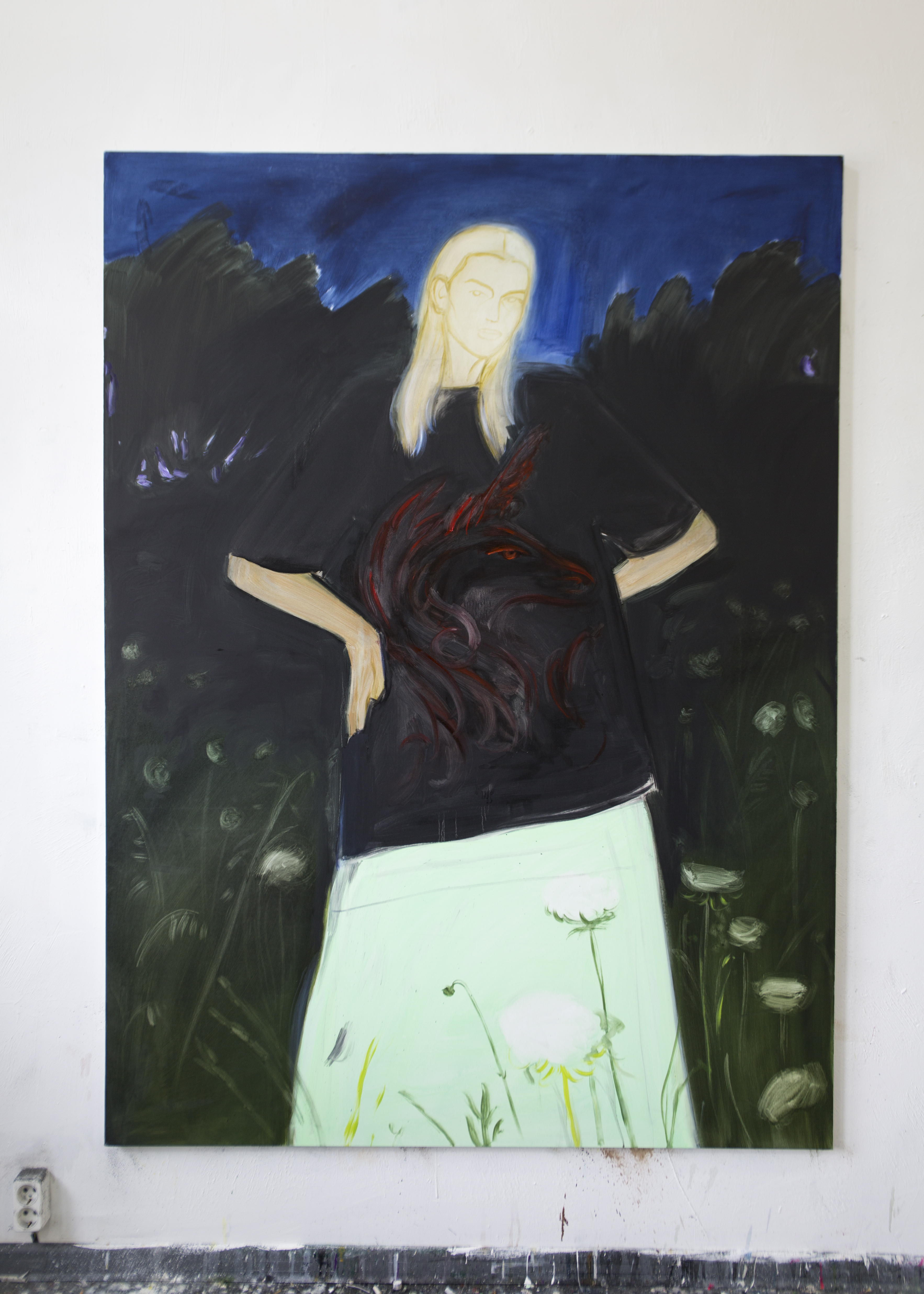
In regard to the fragments, you mentioned before, I find this really interesting. I think this is most overt in your painting of the woman reclined on a sun-lounger in a dandelion field wearing sunglasses and a neon yellow longsleeve with the Victor Pelevin book Священная книга оборотня on her lap. Sorry, I don’t know the title of the work! Could you talk a little bit more about what you mean about the portraits being fragments? And, if it’s not too intrusive, maybe breakdown a work with lesser obvious references?
I think what I mean by fragments is that it only describes a specific moment and there isn’t much happening in terms narration or action. When I look at other people’s work, I often notice that I tend to like things that give me a space to create a story of my own and I want to allow this space for the viewer within my work.
Another reason why I call these portraits fragments is because of how I think of my all my work as a whole body. That is, I don’t create series or use the same characters, there isn’t a continuation or development of a story. Each new painting is a new start in terms of what I want to achieve or describe. So, when the work is put together in one room, I can’t help but think of each painting as a fragment, since different things are going on in each one. They can exist apart from each other, but I also hope they make sense when they are all together.
As for the references behind that painting (its title is quite direct, Summer 2020/The sacred book of the werewolf), I think it’s important to mention that it was made during one of the first lockdowns in 2020. I was staying in a country house nearby Moscow, feeling quite isolated. I spend a lot of time outside, going on the walks around the area - we have some fields and a forest, so even though it was scary because of the Covid, at the same time it felt very serene being close to nature and having some time just to yourself. I really wanted to depict that sense of a summer in Russia. It is quite specific, this breeze of a fresh air and it’s sunny and quiet, you can hear bees buzzing around and spiders crawling up in your hair. I was thinking about how people in Russia spend their summers going to dachas and it might not be even that hot, but you try to spend as much time in the sun as possible. That book by Pelevin is a love story, so for me it was a way of bringing something joyful and sweet to the work. Plus, it must be my favorite book cover ever. The figure is almost too big for the canvas, she doesn’t fit properly, and her pose is rather provocative with the legs open. This is an ongoing theme in my work, women claiming space with their bodies. I probably had some references for clothes, but they are not specific. I thought about neon and reflection and how if the sun is too bright the light might dissolve in that neon top. Maybe I was playing with the idea of making something psychedelic but at the same time serene. I quite like when there are opposing concepts in one work. The clothes also feel like a second skin or armor, which probably comes from the text I read by Helene Cixous ‘Sonya Rykiel in Translation’. In that text she reflects on how some clothes become war armor, shields and some clothes become 'mirrors' in which one feels at home. I think I was looking for a feeling of being protected from the outside world.
Okay, there’s a lot of things there that I want to unpick and discuss further! But on a slight tangent as you mentioned Russia; you studied in the UK, from Foundation at Byam Shaw, BA at Slade and MA Painting at the RCA. Do you see a difference in the work you made in London to what you make now in Moscow (or work you have produced on residencies)?
I think there is a difference but probably not that drastic. What I mean is that when I was living in London, I was absorbing the culture there. For example, I would listen to a lot of grime or I was following what was going with the music scene there, like going to all those underground electronic parties. I think I was also inspired by people that went to such things, overall, it felt new and exciting and was feeding into my work. I was also following fashion more closely, for example going to Machine-A was one way of research. Besides, there are art openings every week in London and lots of opportunities to see great museum shows. Moscow in that sense is reserved and almost isolated. I don’t see as many things, but I have more time to be in the studio and work. Moscow has a huge influence on my work now. It can be as simple as the weather and I have two paintings referencing that, one Snow in March and the other is Cold like Moscow. Or it’s the people and the overall environment, I’m reading more Russian literature these days. But because of the internet, I’m still seeing the same things that I would see in London, only it is online now. I think I prefer it being this way, I’m not too influenced by what is happening in the art scene and can carry on with my work. But it would be nice to travel again and see things in person from time to time. As for residencies, I only been to one in Nizhny Novgorod but I don’t think it changed anything, I kind of continued with my work there.
Faceless Rider, installation view, Szena Gallery, Moscow, 2019
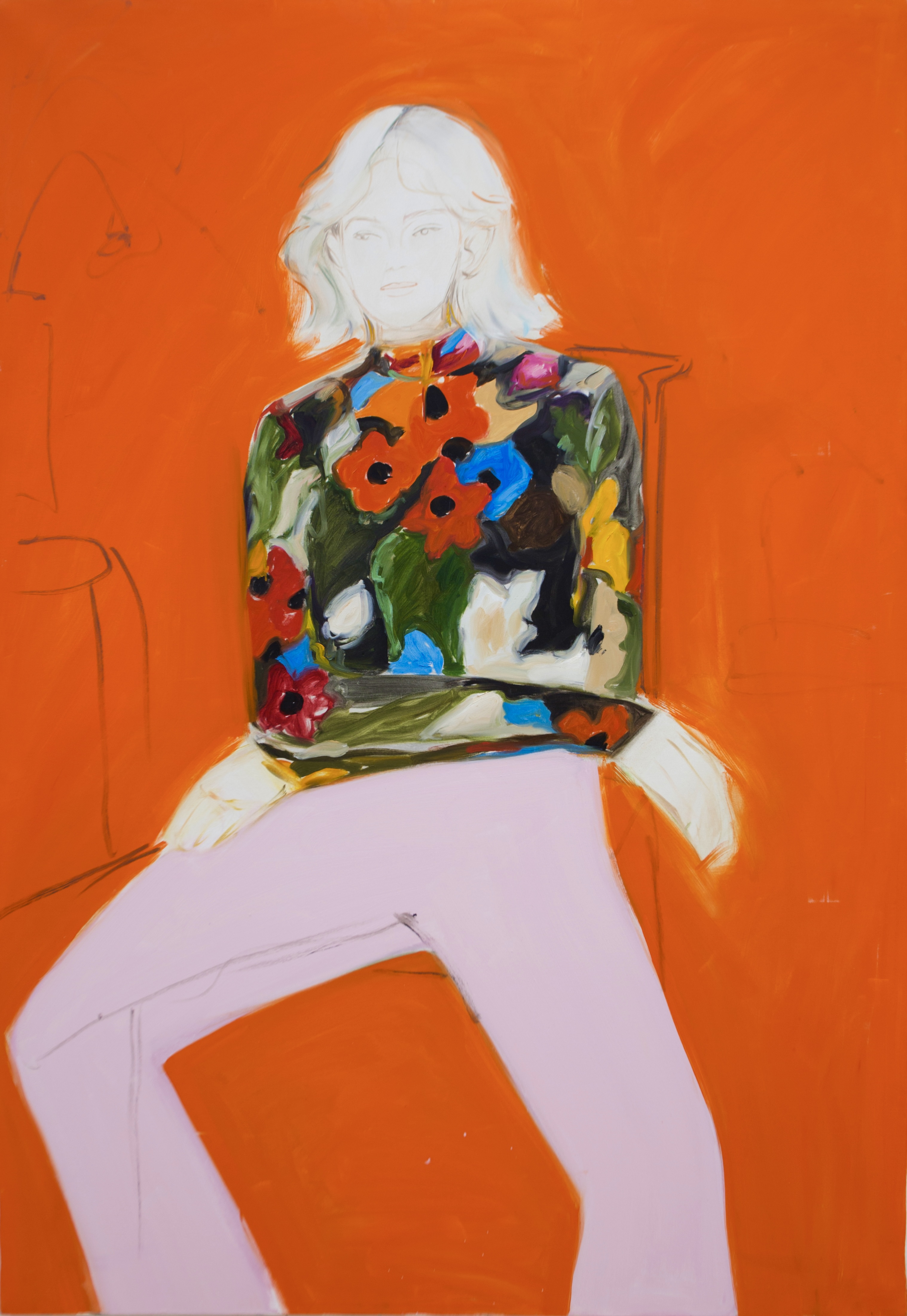 The orange room, 2020
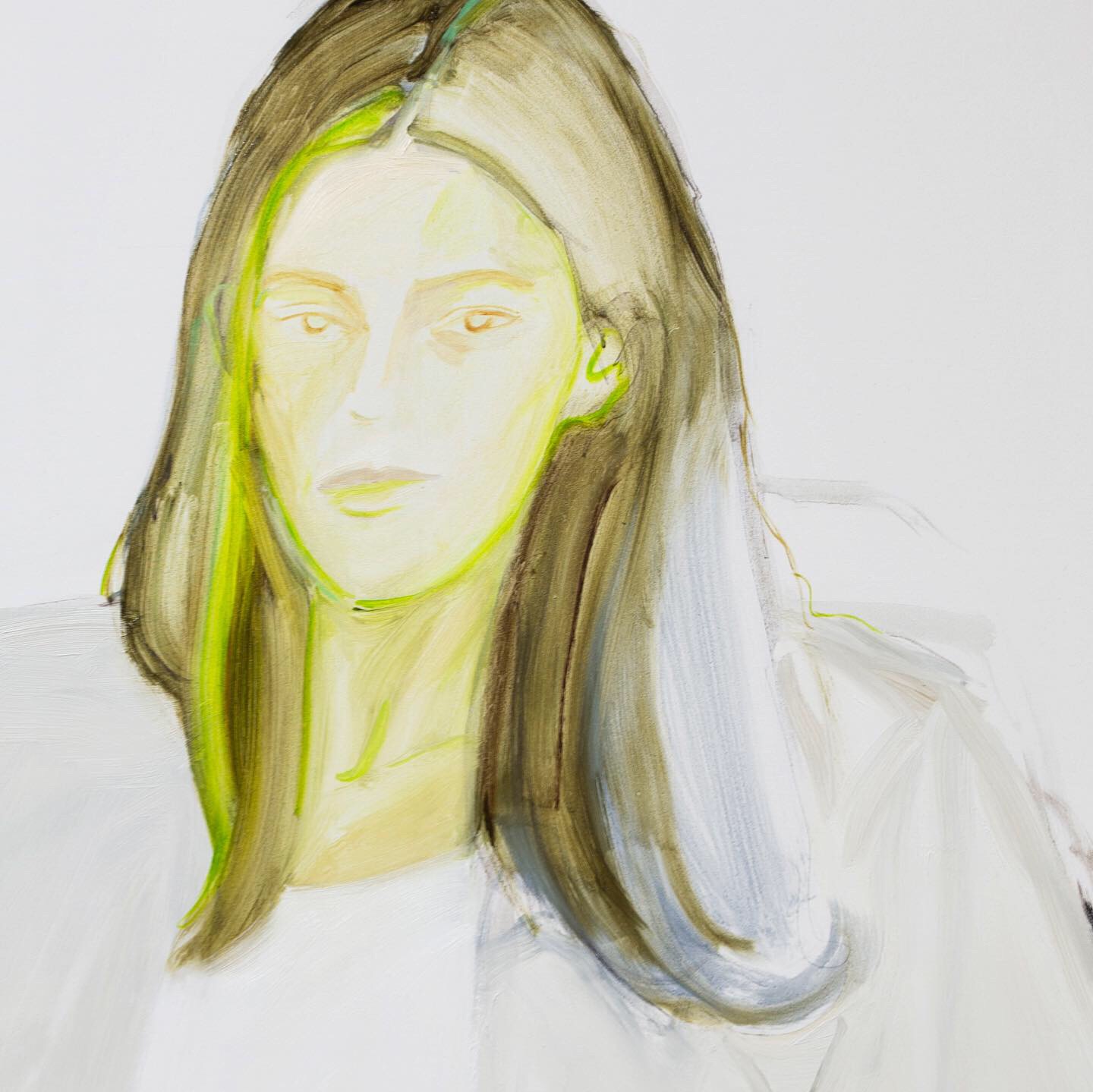
Untitled, detail, 2019
Just to go back to something you mentioned previously. The bodies claiming space on the canvas. The poses. The open-leggedness. The perspective sometimes being from below or lower. I really like this sentiment. The big baggy forms, silhouettes and shapes of the clothes hide / expand / stretch the body. The clothing becomes (visually) the heaviest thing enhancing the body. Then in stark contrast, the facial features in your paintings seem so effortless, gentle and subtle. Ghostly. It’s almost as if a camera flash has overexposed the faces. Is there an intention in this contrast?
It is intentional, although sometimes I have faces that are more solid. I want the body to take over the canvas and for it to have as much presence as possible. Sometimes clothes become abstract solid forms of colour. Sometimes it is more watercolour like and fluid, but overall, I am going for this heaviness that is only accentuated with the form. I think it might be something to do with the structure within a painting. The figure becomes an anchor. But with the face it’s another story, I don’t want to paint a specific person, but I still want the face to be convincing enough. So, I have to balance between how realistic the face is and how much detail I’m giving away. I want it to be open and non-specific, so that if someone is looking at that face, maybe they can relate to the character and imagine that it is them who are painted. I’m actually spending the most time on the face, while everything else takes pretty quickly to paint. When painting, I’m doubting a lot whether the expression is right and so on. With the figure I am somehow more confident, while with the face it is always a search.
Never let you go, detail, 2019
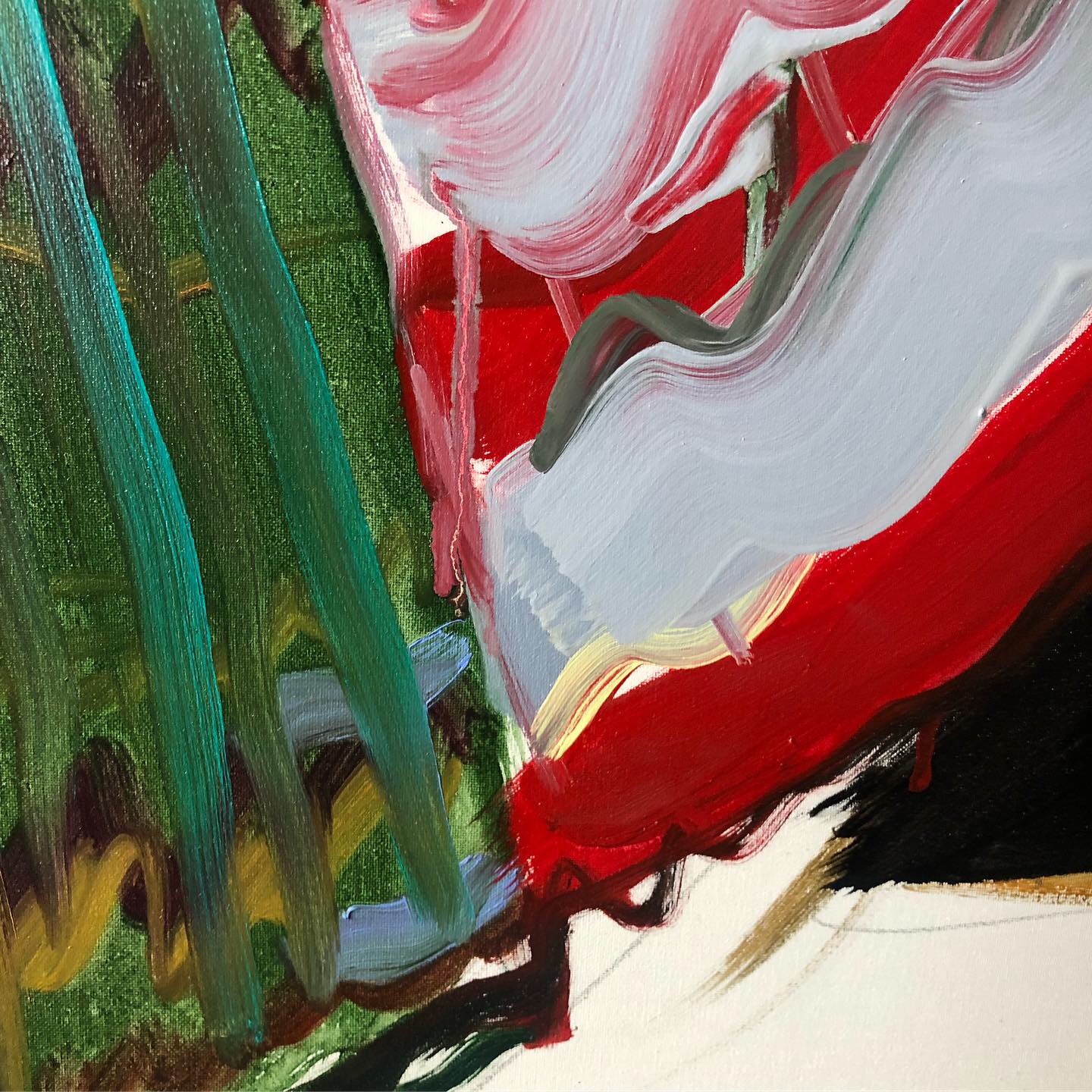
Yeah, I was going to say I like how the paintings can flit between something being more abstract, or more figurative. Closeup; the bristles of each brushstroke plays with this too – whether it’s just pigment and the materiality of paint, or the documentation of the fine threadcount of the garment.
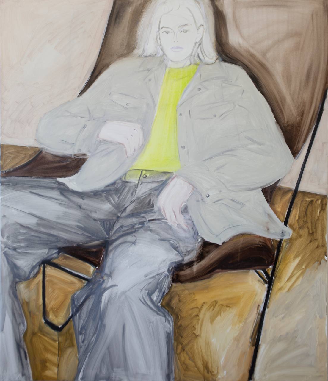
The figures are in quite minimal situations, with space and refined environments. It seems as though your characters have taste(!), for instance, the figure in the Butterfly chair. It just made me think about ownership in terms of materiality, but also linking to what we were talking about in regard to body ownership.
That’s an interesting point about taste and ownership. When I want to include anything in the painting, it usually comes from the perspective of a celebration of that thing, like the Butterfly chair or an archive Issey Miyake top are in the paintings because I think they are design masterpieces and by painting them in a way I’m owning them too now. It is also about an obsession and a fascination with rediscovering that object through paint.
When talking about taste, it’s like talking about good/bad painting. What is good taste? What is good painting? Is good taste a class thing? Could I intentionally paint something ‘tasteless’ and would it still look tasteless or would it transform into a good painting? Could it work in reverse? And if I live in Moscow and use all these references here, how many people can actually understand them? When looking on Instagram you can notice a daily shift in consumer aesthetics and how one day everyone posts about the butterfly chair and the next day it’s some kind of a Hay vase and so on. People have these obsessions and then they quickly move on. In way I’m also fascinated by this idea that that when I’m painting something, I’m giving it more life compared to a tiny image from the phone screen.
Untitled, 2019
And maybe that’s a good place to end, thanks Daria!
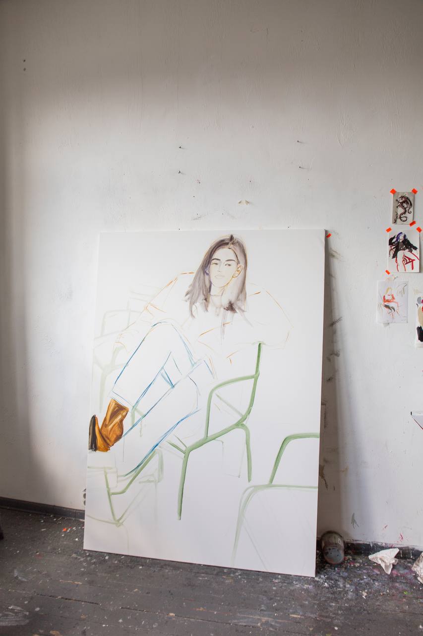
Work in progress, studio shot, 2019
-
@dgita
@dougjbowen
-
If you like this why not read our interview with Jagjit Kaur.
-
© YAC | Young Artists in Conversation ALL RIGHTS RESERVED