Interviews with Artists
Jack Burton
Interview by Elaine Tam
-
Published in September 2020
-
Now living in Brussels, artist Jack Burton explains to me that it’s well-suited to someone who likes the “B-side”. One thing I quickly learn about Jack is that he speaks with a certain poetical free-play, liberally drawing in anecdotes, expressions and analogies. These circumventions never quite seize on anything in particular, but instead gently edge around a topic, or humbly hazard a guess. The slippery quality of meaning — and the inability to perfectly precise it — reveals itself through the oblique tangents Burton takes, a quality which also registers in his artistic language. The result is the spontaneous and indeterminate nature of the work. Enfolding a wild slew of references, it takes on myriad forms — computer-generated image, animation, mural, painting, multi-media collage — at times tentative or tender, at others, brazen or ticklishly absurd. Meaning is not pursued; moreover, the artist invests in an intuitive, cumulative process of working which has borne thematic and aesthetic motifs, though their emergence can be as much to the artist’s surprise as anyone else’s. Could Burton’s long-standing interest in signs tell us something? Perhaps insofar as it likewise extends to the sign’s pluralism: as object, semiotic, indication, event — at once both a verb and a noun.
-
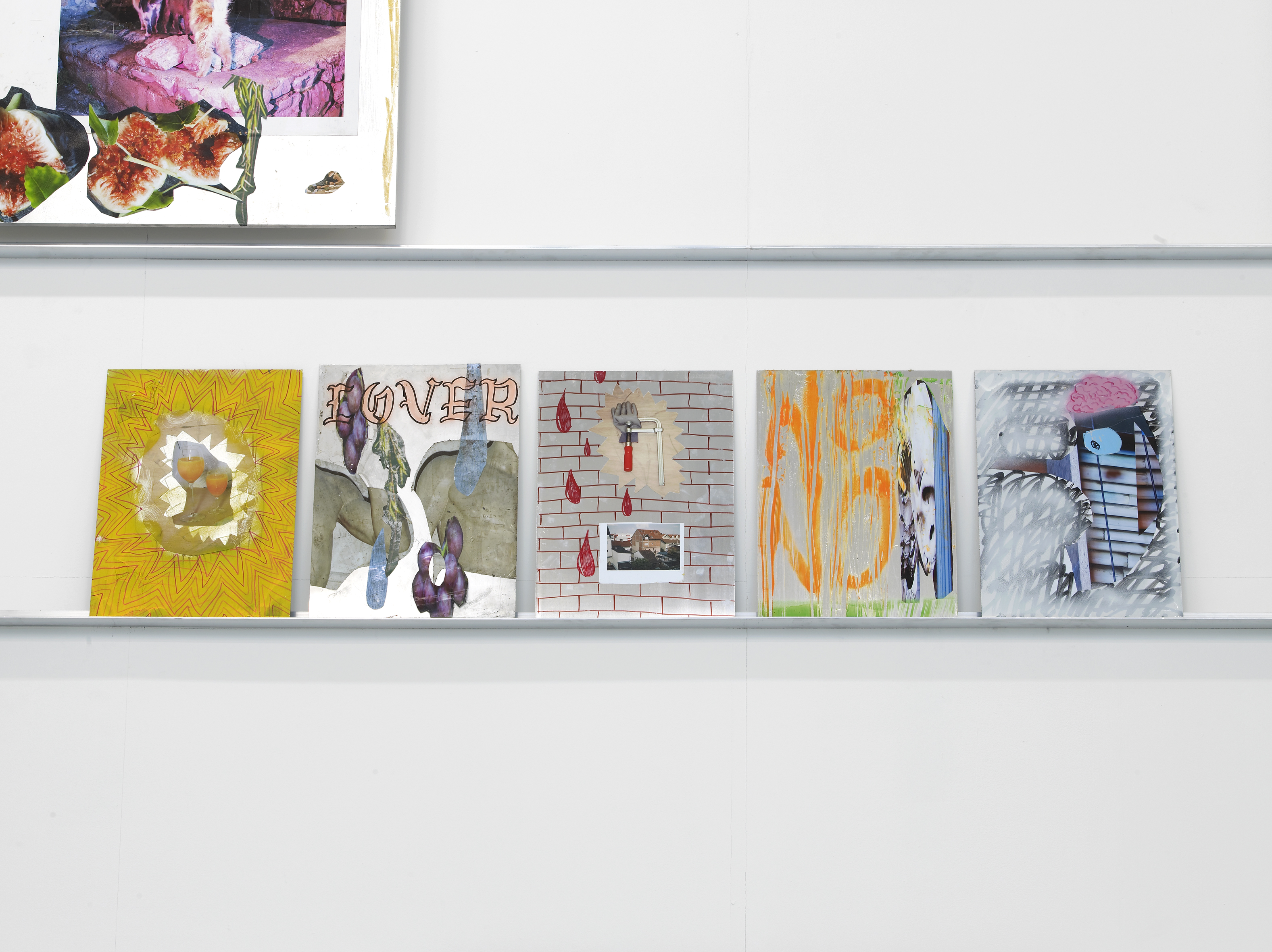
RA graduation install shot, 2017.
Photography: Andy Keate
It was not until your degree show at the Royal Academy in 2017 that I came across your work. During your time there, I understand you had made a series entitled Fever-Dream Collages. Do the methods and ideas that are inferred by such a title still resonate with your practice?
At the time, it reflected more the state I was living in. Being at the RA and being in London at the time felt like being in a pressure cooker, in both a good and bad way. And in the studio, I felt like I was in a constant battle with my own mediocrity, so in the last year I switched from making staged photographs to large collages on aluminium panels. The philosophy was “throw everything at it” — maximum energy, maximum disruption — and to not worry about themes or content. I was confident that if I made enough of them something would emerge organically. The title really just reflected my state of mind in the studio. Now that things are a lot calmer, the work is becoming simple and considered. I am more interested in something of a poetic gesture, where very minimal means create a big feeling.
The opening up of images — what in other circumstances would be words — onto new possible uses, is indeed poetic. Instead of trying to relay a specific intention or meaning, there are effervescent things: colourations, moods, maybe a semblance of a face. The way in which disparate elements combine calls for free association which, in turn, inspire other emergent images.
When I was making the collages, I had this constant image, or a kind of dream: of two eyeballs moving independently through space, chewing through everything they saw, without necessarily reading the world in the literal sense, but letting everything add up. I have a strong belief in visual intelligence — our ability to process what we see in a very complex and nuanced way that maybe evades words, or is pre-lingual. Then, I also think artworks are like guitar pedals in that you might put a clear signal in — your intent or meaning or whatever — but what comes out is an octave higher with a super crunchy sound and now it's something else. This is all to say I don't think I've ever pursued clear meaning in my work.
Digital collage for the hoardings of the new Gesso Art Space, Vienna, 2019
Digital collage for the hoardings of the new Gesso Art Space, Vienna, 2019
Yes, I noticed the faces you superimpose over background images. They seem to act as a recurring character in the work. Don’t you think the recurrence of one motif or another signifies anything at all?
I think about this and to be honest, I'm not very sure. They are things I get stuck on, feel compelled to repeat. Perhaps with the iterations I get closer to something but I don't know what it is yet. But with the eyes and mouths they play an important role, they bring a sense of agency to the work. Either something is being looked at, or is looking back at you, and it activates the whole scene.
The musical analogy was also fascinating to me, because the “shelving” at your degree show reminded me of musical staves, allowing for the simultaneous stacking or crossing of notes, wherein something can “strike a chord”.
I felt the shelving was a really important way to get out of some kind of hierarchy of “this is a big important work” and “this is a small secondary work”. It does mirror that sense of musical staves, one line isn't more important than the other, it's just where the notes sit and hang out where they are.
Is a non-hierarchical approach something that has to be struggled for? For a viewer, it can be easy to tend towards certain assumptions, presumed logics, conventions of seeing and thinking. But then again, without those clear ways of directing your attention the work can feel confusing or overwhelming. But that does not differ from walking in the streets, I guess, being confronted with intensities, ongoings, things of varied scales.
It was never an explicit strategy but something that developed through trial and error. When I was making photographs, people would often say they don't “get” the work because why did I make it? — which is something generally not asked of painters. And I had my own misgivings about how the final print flattened some of the energy that went into the production. So the very simple way around this was basically to use exactly the same production methods, but all on the surface of the work. It was easier to relate to the work in terms of its affect and emotions. Everything followed from that. The installations disrupt the normal hang to give the work exactly what it needs. Sometimes a big, very well finished work, needs to sit next to something half made or falling apart, so that the small work can trip up the big work and put it back in its place. My friend once said to me, which I love: “The best painting in a show is the tiny small one that tells all the big macho paintings to shut up and sit down.”
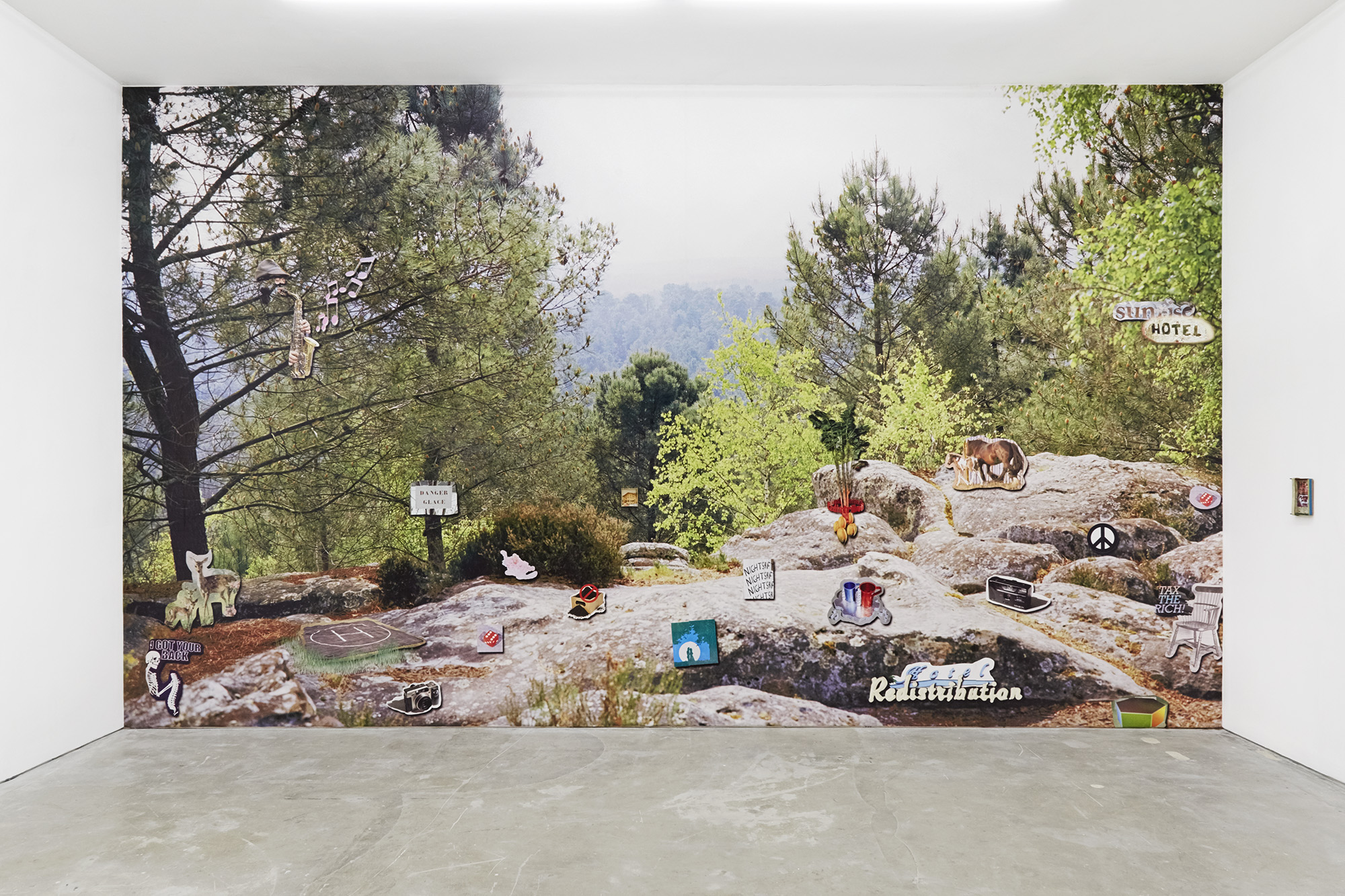
Keep On Keeping On, wallpaper as part of Pro-Social Fries, Castor Gallery, 2020.
Photography: Corey Bartle Sanderson
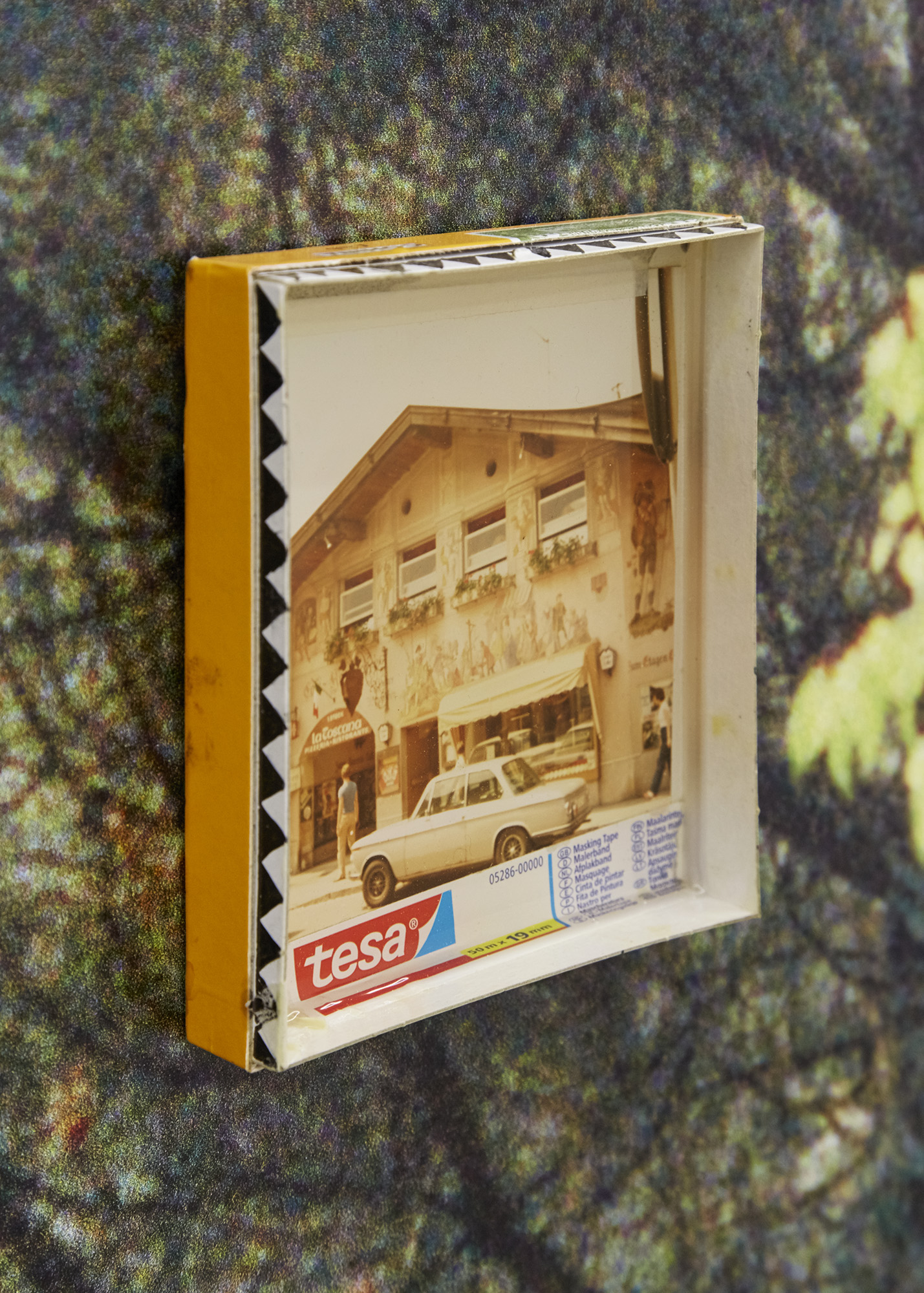 Not My Holiday, found c-type print,
resin, masking tape, cigar box, marker pen, 2020, 10 x 8 cm.
Not My Holiday, found c-type print,
resin, masking tape, cigar box, marker pen, 2020, 10 x 8 cm. Photography: Corey Bartle Sanderson
That’s brilliant. And yes, as your works can really differ in scale, how do you intuit what is the right size for the right work? I'm aware you are inspired by handmade signage. But typically in signage, it tends to be "the bigger the better" — the more visibility or footfall, the more expensive the advertising space. Some of your works are antithetical to that: small, intimate, tender. Are those then no longer signs?
I've always loved playing around with advertising “wisdom”. I have these jokey slogans for myself like “if it looks good it is good”, which I say kind of ironically, but there is also a truth in it, going back to that visual intelligence thing. The role scale plays is a part of that, something I let my intuition lead on. I don't really have any rules for it, and I don't put any extra value on works that are bigger, or took longer to make. In fact, my favourite work in the Castor Projects show is probably this tiny one made very quickly: putting a found photo of someone's holiday into a little cigar box with some masking tape and pouring resin over it. It's still in this language of making signs, but also a counterpoint to the works that use language with a loudspeaker.
Wherefrom is this fascination with signs? Some of the works behave as band posters, flyers for events.
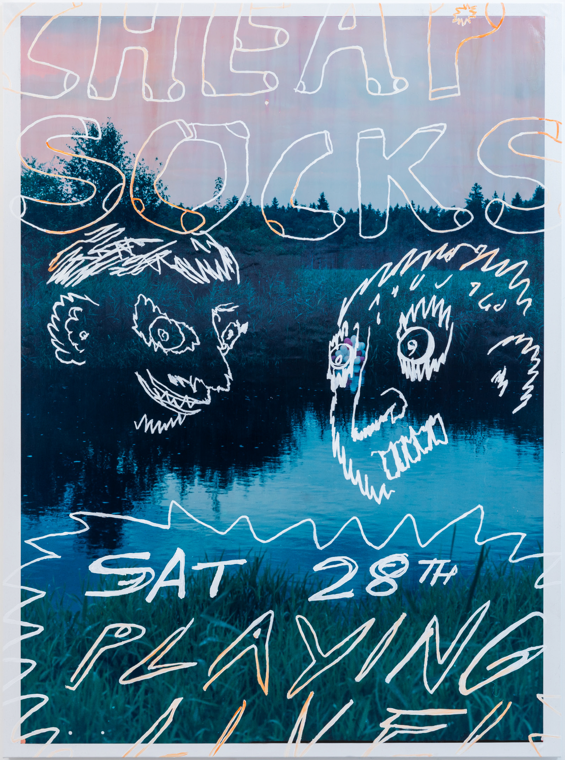 CHEAP SOCKS, oil paint, unique
c-type print, on canvas, 2019, 180 x 130 cm, as part of Greetings,
Mauve, Vienna
CHEAP SOCKS, oil paint, unique
c-type print, on canvas, 2019, 180 x 130 cm, as part of Greetings,
Mauve, Vienna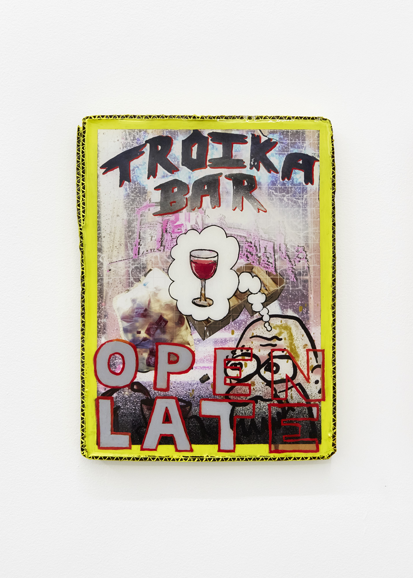
Troika Bar, oil paint, archival pigment print, resin, cardboard, 30 x 20 cm
It probably comes from where I grew up — in Wales, Barry and Milford Haven — where I would often see these handmade band posters on bed sheets tied to roundabouts. I just loved their sense of urgency, the way they disrupted the normal scenery on the roads of hedges and billboards. And then also, the highstreet in Barry used to be full of independent shops, many with handmade signs, and there was just this sense of community and local economy. The highstreet, like most in the UK, has been decimated by chains, online shopping and super high property prices. Now, when you see them, these handmade signs have this extra energy of representing an alternative to our exploitative, global economy. That's my affinity with them. Then, I also love working with layout and I need a format to work with.
And are the contents of these signs fictional entities — if so, how far do the imaginary scenarios go? I guess I'm dying to know if Troika Bar is good and if I should visit.
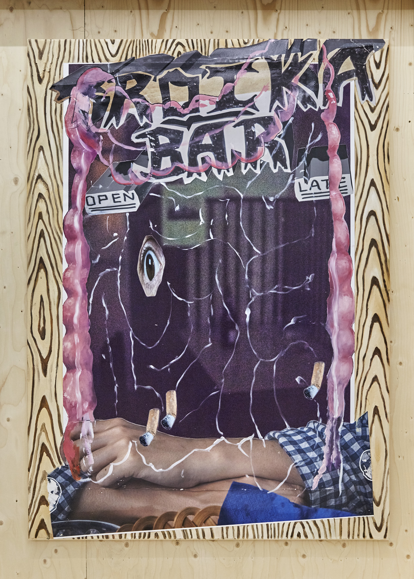
Troika Bar, oil paint, archival pigment print, on canvas, 2020, 180 x 130 cm as part of Habitual, Castor Gallery, London
Photography: Corey Bartle Sanderson
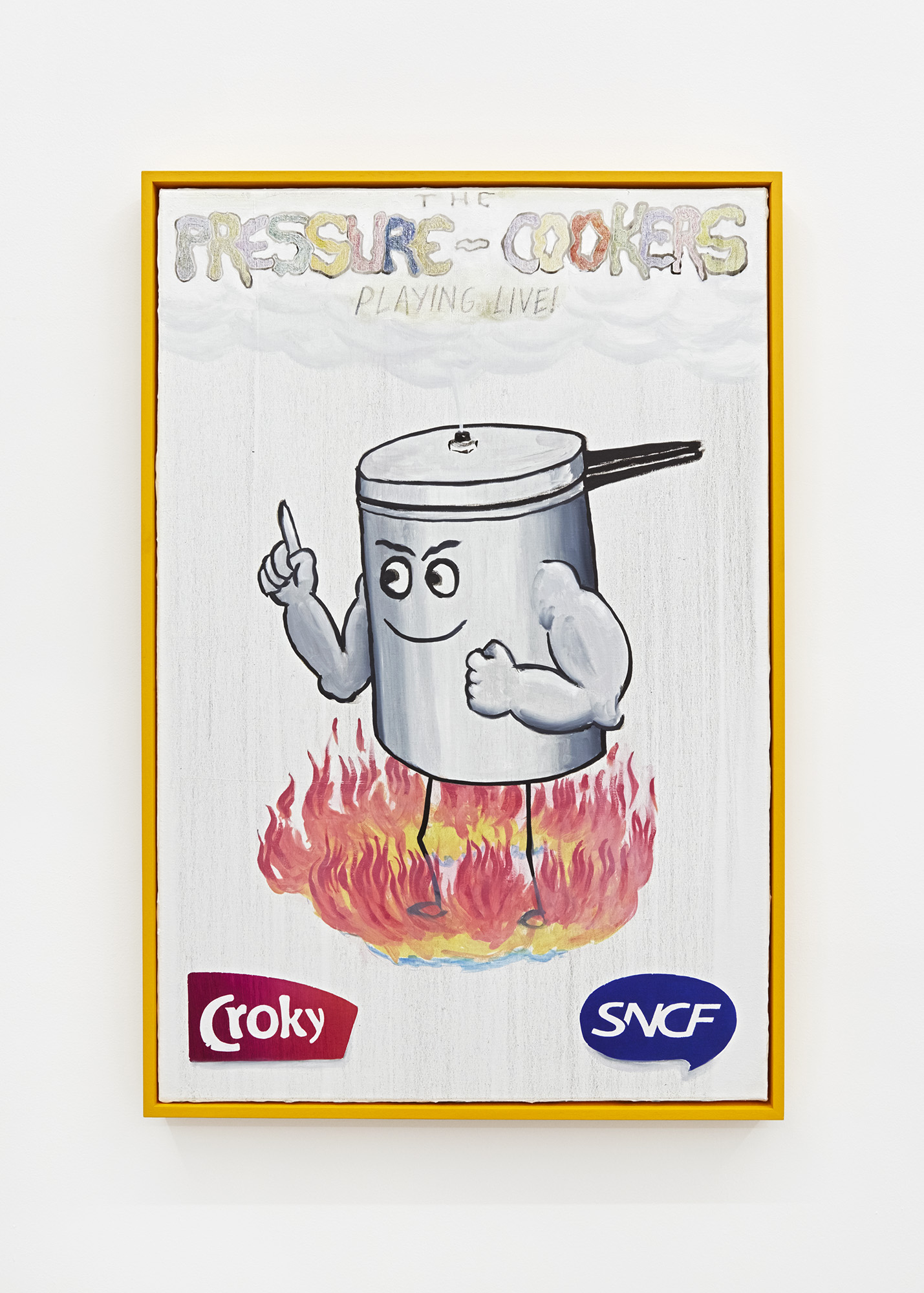
The Pressure Cookers, oil paint on canvas, custom frame, 2020, 90 x 60 cm
Photography: Corey Bartle Sanderson
About the imaginary scenarios, what I love about a handmade poster is this promise of an event and an experience, that might only happen once, and it might be good or it might be bad. You have no idea, especially when the band is called 'the pressure cookers' or whatever, but you know something will happen. Troika Bar started as a place for me to imagine where Jean Claude Juncker would go to feel miserable about the austerity the Troika was pushing onto countries during the crash. Then, it kind of stuck in my head as this imaginary place where nefarious forces come to mingle. So I guess it would be interesting to visit, but the vibe would be quite heavy.
The confluence of promises and protagonists that come together in signs and posters make it perfect for creating desire, anticipation and excitement. I loathe to think that the incursion of signage by major corporations has already happened, and is now the most pronounced landscape of imagery in all metropolises. It would be “a sign of the times” — the domination of public space and imagination by monopoly capital. Does this subtext always underlie your work? In 2018, you had a show at Josh Lilley, Emotional Paintings about Economics, which is when this tenet of the work seemed to become more apparent.
Yeah, that was the moment when it crystalised. But it's never really my intention to make work that has this explicit economic theme, it's just that it's often the lens I view the world through, especially current affairs. I'm usually bringing it back to this question of inequality: will this thing that's happening or being proposed increase inequality, or will it redistribute wealth? I also enjoy working with it as it's such a clunky fit — I don't think it really works in the sense of me reading some economist's analysis and then putting it into the work.
The clunky fit gives the work its humorous quality, which I feel all the more in Pro-Social Fries.
I think they act as placeholders for those ideas, or 'what if?' situations, like what if there really was a chip shop called the 'Progressive Taxation Frituur'? I guess that is me hoping for a reality where we are not just overwhelmed by the interests of massive corporations in the places we live.
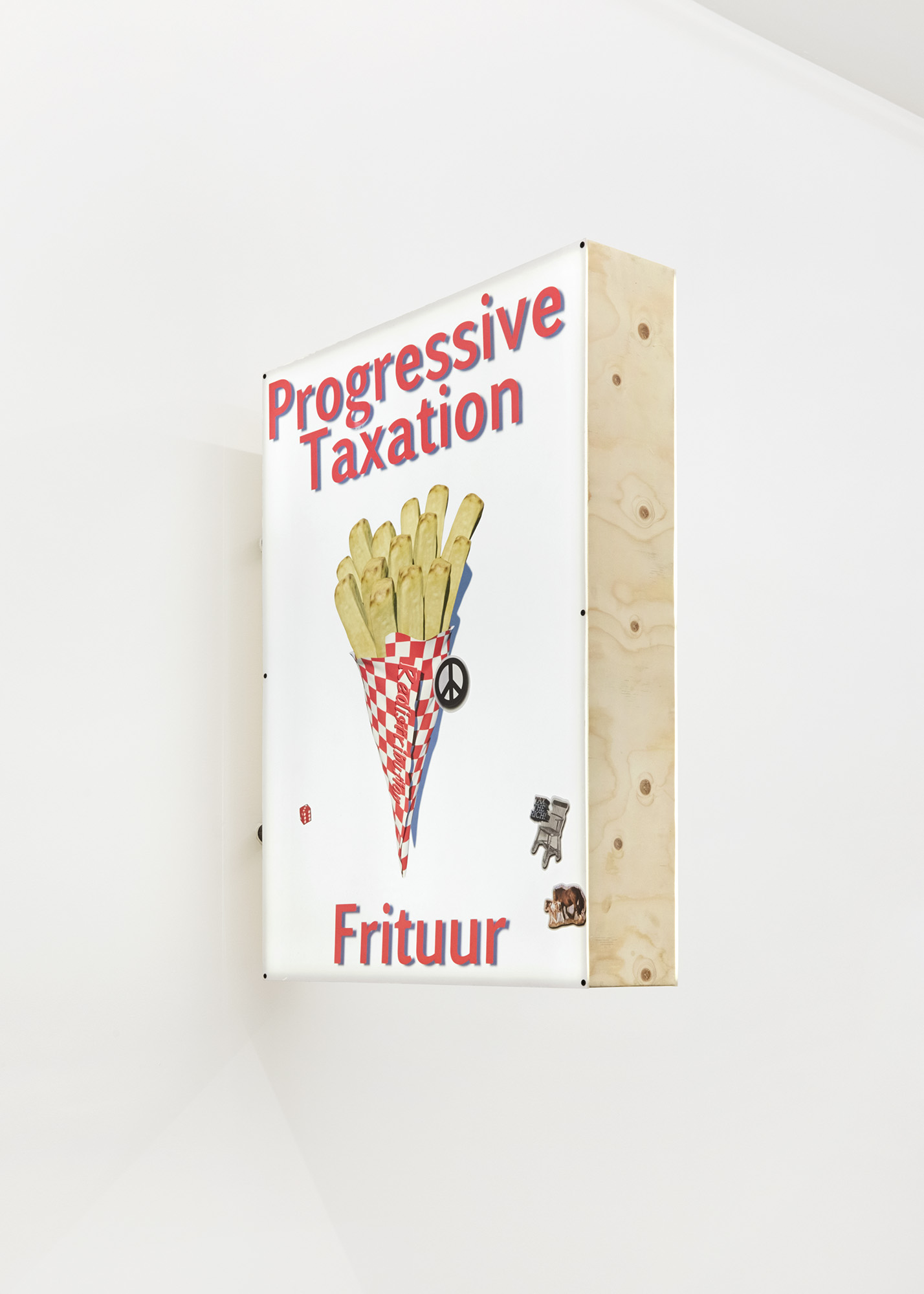
Progressive Taxation Frituur, archival pigment print, resin, plywood, led lights, 2020, 100 x 75 x 30 cm
Photography: Corey Bartle Sanderson
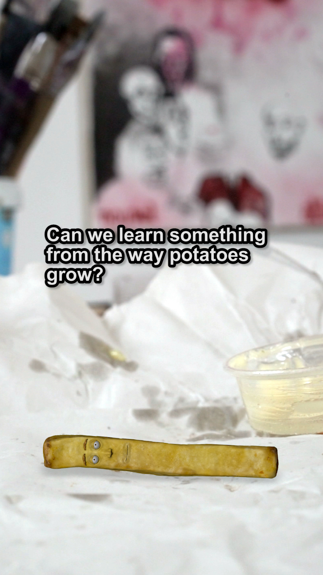
Film still taken from Pro-Social Fries solo show, Castor Gallery, 2020
This hope for an alternative reality: would you describe your work as speculative at all, in that case? An attempt to incant a speculative future, or the possibility thereof?
I'm weary to make that claim, as I don't see them proposing solutions, or trying to be a rallying call. I don't want them to come across as protest art, not because I don't believe in protest, I'm just aware of the context they sit in — my privilege, and so on. And that's why the humour is very important, as all of it is just a conversation I'm having with myself in the studio. I heard this thing about Kafka, he would always write at night and his neighbours complained they couldn't sleep because he was always howling with laughter. I’m not sure how true the anecdote is, but I feel it encapsulates what I’m looking for when I’m making work — that things I set in motion surprise me to the point of laughter — and often, that comes from the work saying to me ‘but what if this…’
In Pro-Social Fries, there is a clip wherein your neighbour embodies a chip with a face, which reminds me of your earlier comment with regard to faciality, agency and attention. Could you elaborate on the connection between the nature of potato growth and redistribution, and how this came to mind as a model or metaphor?
There was so much Brussels in the work I was making that I needed to make it explicit. But I also needed to have a Belgian voice in the show, as I've only been here two years, I am still a tourist to some degree. I had this idea for the frituur sign, but was worried about going straight to this first cliché. So I started researching the history of farming in Belgium, and it was very interesting and very extensive, more than I can go into here, but a lot of the internal history of Belgium can be looked at through agriculture, and potato-farming in particular. This is the thing I really like about economic and historical research is you start with the potato and you end up with the workings of the modern Belgian state, the emergence of the middle class, and so on. After all that, I had this idea: how would a potato view the modern economy, and what kind of politics would a potato plant have? When you think about the way the plant grows, it's inherently distributive in the way energy is created from light and then distributed to the population of potatoes below the surface. So I went to my neighbour and asked to interview her about Belgium as if she was a chip, and just let it run.
It's all quite animist in thinking, to learn from the chip as though it could have a conscious stake in economic affairs. And needless to say animism shares a root word with animation. So in the same vein, but with reference to your digital exhibition at Galerie Barbara Thumm, I wanted to ask: what is Europa’s sentiments towards the rock?
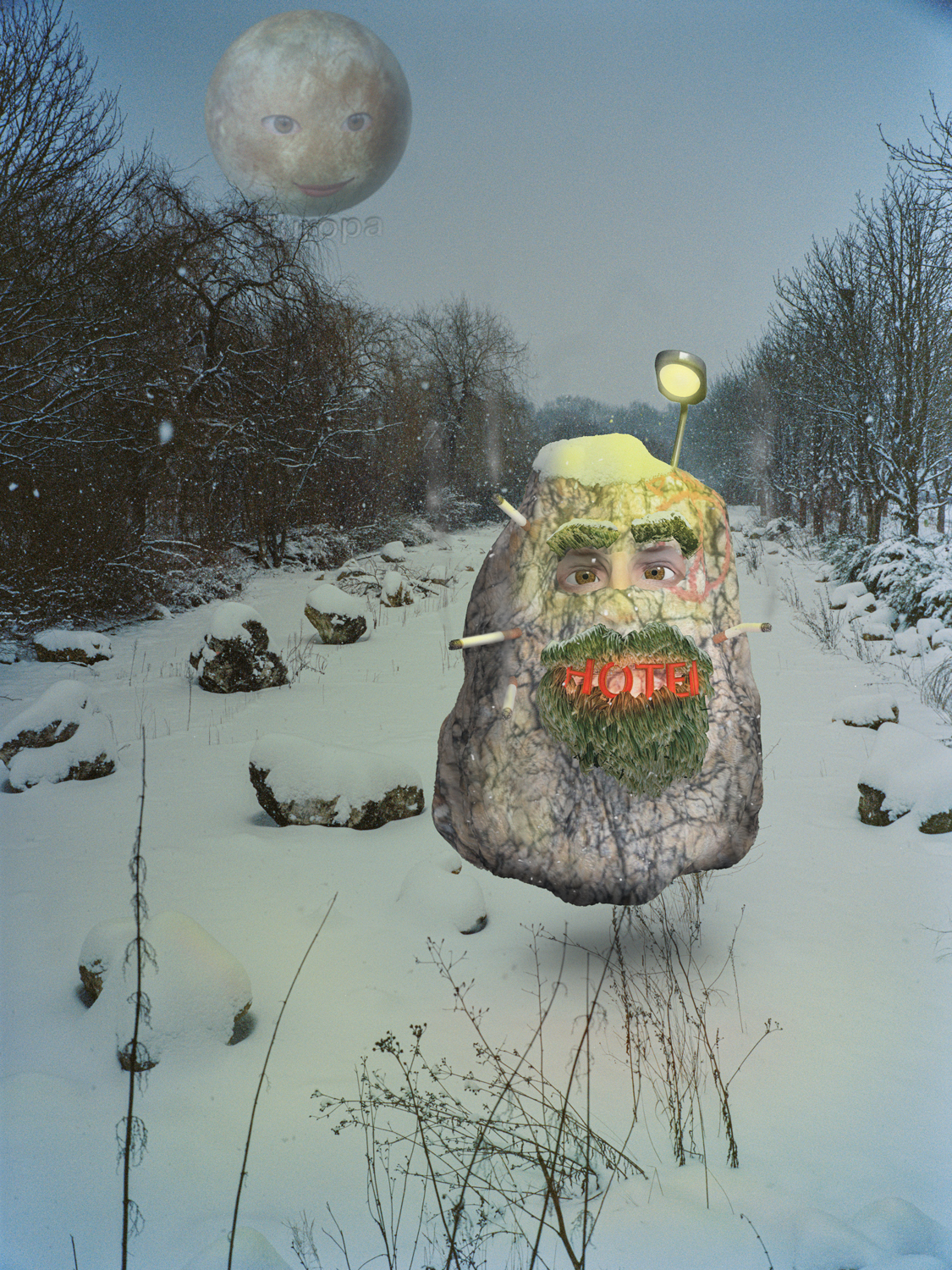
Europa and the Rock, archival pigment print, 2020, 40 x 30 cm
Edition of 3 + 1 AP
It’s embarrassingly simple. Europa — the planet, a moon technically — is the celestial embodiment of Europe, the Platonic ideal in the heavens, perfect and just. The rock is the embodiment of Europe as is now, this post war project that, with all its failings, is still shining a light, still with a peace sign daubed on it. Still smoking. And the ideal of Europe is still looking lovingly at the rock as it makes its way in the world.
That was a beautifully told story! And its complexity is in its simplicity, as seems to be the case with many stories of mythic proportions. I want to squeeze in one last question: what are your influences or passions?
I think my influences from other artists are fairly obvious. Kippenberger is probably the main one, Laura Owens, Francis Picabia, Barbara Kruger, the list is endless really. I also take a lot from literature; reading W G Sebald when I was younger introduced me to this idea of circling around a topic that is too big to tackle head on. I recently binge-read the Patternmaster novels by Octavia E Butler, and I love that ability of Sci-Fi to show how even a small alteration to our reality can spiral out into a world-changing consequence. Then just a lot of collected material, posters, photo albums I buy from the market here. Memes. Memes are amazing in that they are incredibly efficient in relating word and image. Oh! Skater art and videos! There's this guy who is making his own world in a low-fi, PS1 kind of way, and it's so mad and dark and violent and chaotic, it's a total mash-up of all the popular culture we grew up with. And alongside that, I've been watching a lot of the narrative sequences on YouTube from old games like Time Quest, Resident Evil. There is something so strange and uncanny about those characters that I wanted to look into it for the animations I've been doing, and in general to revisit that aesthetic for the work I'm developing now.
Your interest in memes — the lovechild of gene and mimesis — reminded me of my earlier question with regards to the presence of motifs in your work, to which you replied they are entities in the process of emergence.
Sometimes I worry about how nebulous my influences are. But I can't really work any other way, and often the works start from some kind of anecdotal coincidence or piece of information, something colliding from two different fields I've been looking at.
Nonetheless, there is a coherent “environ” in Pro-Social Fries for a diversity of works to co-exist. Whether thematically or aesthetically — what you referred to as “visual intelligence” before — there is some kind of binding agent. And at the same time, the work manages to retain a sense of impermanence or contingency with the cardboard frames, haphazard daubs of paint, interplay of symbols...
I'm in a much calmer place here in Brussels, where I have the time and space to think things through, so I do think things are becoming a bit more coherent of their own accord. But yeah, I think — to my professional detriment — I will always make work that has something provisional about it.
-
jackburton.eu
-
If you like this why not read our interview with Charlie Fox
-
© YAC | Young Artists in Conversation ALL RIGHTS RESERVED