Interviews with Artists
Lindsey Mendick
Interview by David McLeavy
Published April 2015
-
Lindsey Mendick's work incorporates elements of late twentieth century fashion and images of prominent cultural figures form the 1980's and 90's along with heavy use of pattern and references to interior design. Amongst other things Mendick's work looks at the changing dynamic of our relatively recent cultural history, sometimes in a nostalgic way and sometimes in a critical fashion.
-
You use a combination of bright colours, shiny surfaces and iconographic imagery in a lot of your work. Why do you use these techniques and why is it important?
The sculptures I create are a sickly sweet ode to all things camp. In my practice I desire to acquire and forge the most deliciously fabulous of entities, elevating the everyday domestic object to one of decadence and opulence. By adorning with diamante and colour (whether ceramics I have forged or found items), my sculpture promotes delusions of grandeur, enticing the viewer to revel in the glossy frivolity of ‘bad taste’.
As a child of the 1990s, my sensibility was forged in the decade that taste forgot. The Spice Girls made the headlines daily, Denise Van Outen’s Wonderbra-ed bosom greeted me each morning on the Big Breakfast, Changing Rooms dictated taste (I am still haunted by my Dad’s vomit-inducing pink and orange study), laminated Leonardo Dicaprio posters adorned my walls and every soft furnishing I owned had to be inflatable. In my visual typography, all of these images have amalgamated (along with an after burp of 1980s design) to forge a gloriously camp phantasmagoria of pattern, colour and iconographic imagery that bring me such ephemeral pleasure to revisit. To me they are not techniques; they are materials and iconography that I naturally have an affinity to.
You mentioned how you want the viewer to revel in the “glossy frivolity of bad taste”. I am interested to talk a little more about taste. Different people have very different views on what is tasteful and distasteful and I was wondering how you navigate this difficult and ultimately subjective point of focus.
It is important to me that the work I exhibit stays truthful to my sensibility and is not too burdened with subjective opinions of what is tasteful or distasteful, or what is sellable or popular in contemporary art at that time. There’s just no point in shrinking my aesthetic in order for my work to be palatable for everyone. If I were to navigate or pander to this, I would ultimately end up making a piece that was wholly self-conscious and dishonest to my practice. The work would be so hollow and self-aware. Whilst forging my sculptures, I try not to deliberate if a work is too garish or if people will experience the same desirability that I do towards the piece. Because that’s a futile aspiration. When I create, I try to focus only on my intentions and whether the work is conveying those intentions. People’s reaction to them can never be foretold. As taste can often be a visceral reaction, I believe contemporary art should live beyond personal preference in order to be experienced as the artist intended. In my opinion, viewing art should be about forging a dialogue between observer and artwork, not a means of satisfying a premeditated aesthetic.
As an example of this, I recently visited the Lisson Gallery and viewed the Holy Bible by Broomberg & Chanarin. It wasn't a work that I was naturally drawn to (there was no obvious sparkle or razzle dazzle). But when I spent time with the work, I was deeply moved by the way that Broomberg & Chanarin forged empathetic connections between seemingly unrelated images. They somehow framed love, suffering, happiness, humour; anger…the whole human condition in all its unadulterated flaws… in one intricately conceived work. It was so powerful and it was all consuming… but it definitely wasn’t resolutely to my taste. My reaction to this work made me realise that if we only view art and artists that sit comfortably within our taste and aesthetic, we will undoubtedly miss out on being surprised and stimulated. And too me that’s where I find the beauty and joy in art, in surrendering to the artist’s ability to take me to an unprecedented place.

BITCHIN, 2014
You speak very eloquently about your work and I want to know if that is something you feel is an essential skill for a young artist.
Due to the humorous and salacious temperament of my sculpture, an important aspect of my practice is taking the time to construct clear, eloquent and considered answers when discussing the themes and processes within my work. I feel that this enables me to explain to others how resolutely and uncompromisingly serious I am about creating pleasurably camp and opulent environments. Being professional in my writing allows me to clarify that although my sculpture appropriates frivolous aspects of popular culture; it has a gravity that although often fails, comes from a desire to bring these peripheral aspects of low culture to the forefront of high culture.
Emerging artists are so rarely given the opportunity to explain the mechanics of their practice or to defend their work in a formal dialogue such as this; which is why I am such a supporter of what you do at YAC. As young artists we often apply for open calls and opportunities that give us 200 words or so to condense our practice or our ideas into a piece of writing that best represents us. It’s a format that I have also utilized myself when selecting for open calls in the arts collaborative I initiated (it’s all) TROPICAL . My involvement in both sides of this process has taught me to use language as an extension of my practice in order to entice and encourage a curator or arts institution to pick my work over the 100 or so other talented artists that have applied.
You use pattern a lot within your work and I want to know what your relationship with pattern is and whether you create your own patterns or if you use pre-existing ones?
Pattern has always been prevalent in my visual typography. Growing up, my mum designed children’s clothes for a living and I spent a lot of time in her studio in school holidays. I remember that at one point in her career she worked in a cold, drab warehouse in a bleak area of Tottenham, London. Although it looked unimpressive from the outside, inside it was a dazzling phantasmagoria of colour and pattern. I remember being engulfed by the reams of bright, jazzy fabrics and as a means of entertainment I collected my own fabric samples to make collages of mermaids, and sorted through mounds of garish buttons for outlandish necklaces.
My family didn’t have a lot of money when I was growing up so my sister and I were given the old dress samples for our everyday school wear. My mum believed we should dress ourselves and I chose to wear party dresses with petticoats and matching hairbands every day to school. As I was fabulously attention seeking from a very young age, my magpie-like affinity to bright, bold pattern allowed me to hone the attention grabbing visual identity that earned me the compliments (mainly from Grannies) that I thrived on.
Upon leaving university, I began working in clay as a means to explore my personal history and to free up my practice. Whilst I started to employ traditional forms of making, I also began to research adornment and surface design in order to make the clay pieces more opulent and excessive. Naturally, as a nostalgia junkie, I gravitated towards the culture and aesthetics of my formative era - the 1980s and early 1990s. Contrary to the naïve affinity I felt towards these surfaces as a child, my research into the social history of this period enabled me to look at these patterns critically and pinpoint why they were intrinsic to my taste. From the electric and lively work of textile designers Collier Campbell and the Alexander Francis Group, to the rebellious design aesthetic of Ettore Sottsass’ Memphis group, I became fascinated by the unabashed spurning of the modernist taste that was awakened in this era. I wanted my work to feel as free and unrestrained as this post-modernist approach and felt that pattern was a way of breaking the mould. In the same way that I collected samples as a child, I began adopting and absorbing the pre-existing designs I encountered in an osmotic fashion and soon they began encroaching onto the surfaces of my work. This can be seen most evidently in the work for the S1 members show, ‘Aunt Linda’s Pots’. I feel that through my use of pattern, I was able to create a work that accurately represented the excessive and comprehensive nature of my practice but in a scale that complimented the dynamics of a group exhibition.
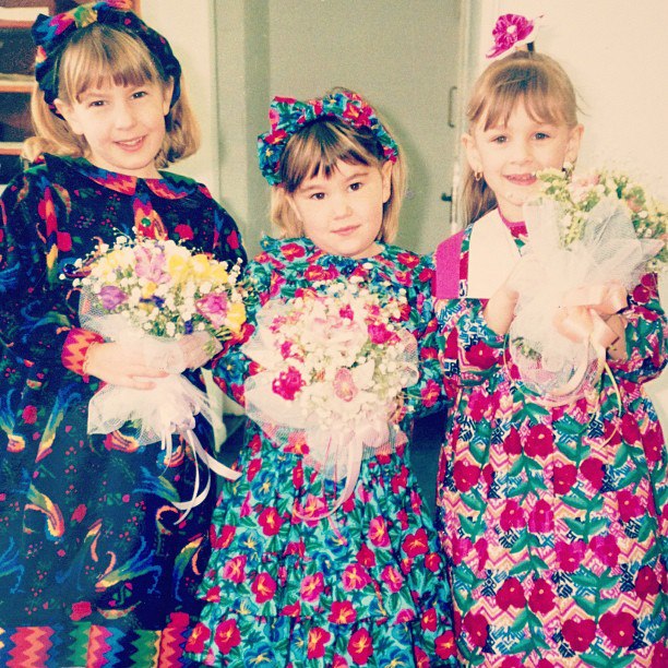
Lindsey Mendick (middle) meeting Princess Anne
You briefly talked about your pots and specifically the series titled ‘Aunt Linda’s Pots’, but I want to know if you feel there is anything significant about the pot itself and its utility or function? Or is it merely a way of using clay in a simple way to allow pattern to be applied on the surface?
I sometimes think of Aunt Linda’s Pot’s as a sickly sweet ode to the 19th century arts and crafts movement. When the pots were envisaged, I was working as an assistant to the curator Fiona MacCarthy on the National Portrait Gallery exhibition, ‘Anarchy and Beauty, William Morris & His Legacy’. My work acquiring exhibits for this major exhibition submerged me into all aspects of the life of Morris and those in the arts and crafts movement who those who shared his visionary ideals.
William Morris said that ‘nothing which is made by man will be ugly, but will have its due form, and its due ornament, and will tell the tale of its making and the tale of its use’. Morris’s unstoppable vigour and belief in craft’s ability to revolutionise society encouraged me to explore hand making in my practice. His tapestries, poetry and wood block designs inspired me to be present in the fabrication of my sculpture as well as intrinsic to its conception. I wanted the hand of the artist to be not only a necessity means of creation but also a feature of the work. I gravitated towards clay over other aspects of craft due to its tactile nature and the way it desires to be manipulated by the maker. Working with clay allowed me to be resolutely embedded in all aspects of my sculpture and to create entities that better encompassed my sensibility.
The ceramics I forge are always a labour of love to the source of their inspiration. Whether the subject is MacDonald’s fries or Domino’s pizza, I employ masochistically fastidious methods of fabrication to inflict a sense of campy gravitas on my sculpture. However, what makes the pieces all the more playful and ludicrous is that they are entirely futile objects. Although the works are made tenderly and with great attention to detail, due to their materiality they are entirely devoid of function. My sculptures are made with low culture mediums such as air drying clay, emulsion, glitter and spray paint. They are never glazed nor fired and they are sealed with Ronseal varnish because it’s so much shinier. And that’s ultimately what’s important when you have a plastic sensibility. The razzle dazzle.
In my desire to make my sculpture as fabulously vibrant and marvellously inviting as possible, the works have become utterly toxic undomesticated objects. But that’s what fabulousness is about, pushing something past the point of function and necessity. In 1963, during a performance at a Holiday Inn in Pittsburgh, Liberace nearly died, after a chemical that used to clean his outrageous Austrian rhinestone costumes was absorbed through his pores into his blood stream. Liberace was hospitalized, with both his kidneys shutting down and doctors sceptical that even a dialysis treatment would save him. Liberace, fearing death was at hand, did the only thing that any dying man would do. He went on an enormous shopping spree, buying fur coats and jewellery from Tiffany & Co.

Aunt Linda's Pots, 2014
You also co run the group (It’s All) Tropical and I am interested to know of the relationship that this has with your solo work.
Del Hardin Hoyle, Lea Torp Nielsen and Josef Zacharchy Shanley Jackson and I started making shows together because we all have a very similar, pleasurable and mischievous approach to making that had often been shunned by those in contemporary art who couldn’t understand our aesthetic. We realised that the only way we could convey to people that we were professional artists that were deadly serious about not being serious was by starting something ourselves and inviting artists with a similar sentience to work with us.
Artists spend their career building and honing a carefully constructed language that best represents the aesthetic and themes that inspire them to create work. Although I love making and being in my studio, being an artist isn’t actually as glamourous as it looks to an outsider (especially when you’re eating a subpar Sainsbury’s meal deal at 12am in the freezing cold, listening to Fifty Shades of Grey on audiobook). It can be quite an insular and lonely career that at times, can feel stifling and like the 9-5 we rebel against. For me, Tropical enables me to enforce (much needed) sabbaticals in the intricate and monotonous aspects of solo work and experiment with ideas that are perhaps not fully resolved. In (It’s All) Tropical, we aim to produce exhibitions that invite the artist to break the confines of their studio practice and create work that feels freeing and challenging to their everyday practice.
The members of (It’s All) Tropical try to make work for all the collaborative projects we instigate as we feel it is important that we never ask an artist to do something that we wouldn’t be prepared to do ourselves. For example, in the most recent show we curated, NO GREY AREAS, we asked artists whose use of colour we found to be intoxicating and enriching, to create works in only black and white. No sweet fades, no tones, no grey areas. For many of us in (It’s All) Tropical, colour is our weapon of choice and so for us, this project was stifling and angering. I absolutely hated it. However, I think we all ended up appreciating the challenge of the theme and were surprised by the way it enabled us to develop other facets of our visual vocabulary that hadn’t always been as prevalent as colour.
Working collaboratively in this manner has taught me not to be precious in my practice. (It’s All) Tropical installs can be tempestuous affairs due to the fact we are all so resolutely ingrained in the exhibition. Each one of us is unafraid to say when something isn’t working, or when we’re being too self-conscious in our practice and our curation. We have a common goal of trying to achieve the most exhilarating exhibition for the viewer that we can so it is often an excruciatingly honest place to work where pride has to be left at the door.
An example of this is when we hung OVERSEASONED PART DEUX at Salt + Powell in York. We arrived on the Saturday and were totally overwhelmed by the size of the space. It was fucking massive. Bigger than anything we had done before. At the time, it was only Del and I in Tropical and Lea was just starting to work with us both as an artist and curatorially. Due to our inexperience and a lack of communication between us, we hung a safe show that lacked the jovial spirit of the first Overseasoned. As we left for the evening we were all completely crestfallen by the whole experience. In the van back to Sheffield there was a horrible palpable silence, devoid of the excitement and sense of possibility we had had on the drive up. I asked Lea what she thought of the show and in her wonderfully Danish way she told Del and I that the exhibition wasn’t doing anything exciting and that it was just pretty safe. Although it hurt hearing the words said aloud, it was exactly what we needed to hear. I obviously started to cry but after I had stopped (and swallowed my pride) for the next hour we had a conversation about curation that made us hum with excitement. We realised that we could curate a group show that embodied the Tropical ethos and all that we wanted it to be if we stopped being self-conscious and caring about whether we failed. When we got back to Sheffield, Del and I sat in the pub and drew out a whole new layout on a bit of scrap paper that we implemented the next day. For me, that’s when (It’s All) Tropical really started.

Overseasoned Part Deux, installation shot, (It's All) TROPICAL and Salt + Powell, York
I think it’s admirable for an artist to admit mistakes that they may have made or retrospectively assessing the positives and negatives of projects or individual works such as you seem to have explained here. I am interested to know if you would ever curate exhibitions on your own or if you consider all of your curatorial practice to be in collaboration with the other (It’s All) Tropical members?
I get really nervous talking about myself as a curator, because I honestly don’t see myself (or Tropical) as taking that role. The title of curator holds such a sense of responsibility and has this resolutely ingrained gravitas that doesn’t sit well with the way I approach art. It’s so serious and weighty. I think of the exhibitions that we put on as happenings /experiences that are conjured from a longing to make an exuberant idea a reality. Our exhibitions are created primarily for the public to enjoy themselves and to see that viewing art can be a pleasurable experience rather than one saturated in anxiety. And that’s a desire that’s ingrained in my practice and my personality. To entertain people.
Although Tropical is such a massive part of my practice, I also enjoy creating niche exhibitions that perhaps aren’t as immersed in the (it’s all) Tropical ethos such as OVERSEASONED and £1 Fish. But what’s wonderful about starting a collective from scratch, is that we also get to create our own rules. When we started talking about what our collective would be, we acknowledged straight away that in order to retain a sense of artistic freedom, we should be able to individually create exhibitions under the Tropical umbrella and rely upon the groups critical input and support. Even if the exhibition isn’t a concept we all agree on. An example of this is a very new project I am working on at the moment…A SPICE GIRLS exhibition.
Last year I was informed (by a lovely gentleman) that the artist Liz West held the Guinness Worlds Record for the world’s largest Spice Girls collection. As the Spice Girls aesthetic and ethos are resolutely steeped at the epicentre of my brash, technicolour sensibility, this information made me fanatically excited. I contacted Liz and begged her to let me and other artists whose practice was saturated by 1990s nostalgia and popular culture to work with her collection. Liz thankfully loved the idea and now this crazy idea is becoming a reality. This autumn, she is opening up her Spice Girls collection in order for 6 very lucky artists to choose items to work with for a new group show that explores the effect this era had on their sensibility.

Do It Beautifully, 2014
Your work has developed a certain style, not necessarily visually, but perhaps in its approach to the 80’s for example. Are you ever worried that it may be difficult for you to change direction in the future if you decide to focus on something entirely different?
Definitely not. I think of my practice almost as holiday snapshots of a hyperreal domestic paradise that resides in my mind. Every time I start a new work, I delve into this gluttonous technicolour pool of hedonism and create artefacts of happenings that I wish existed. Anything goes in my paradise; there are no restraints and I control what’s within it, so inevitably it will evolve with any direction I decide to take.
This realm is made up of all the things that bring me the greatest pleasure. As well as 1980s and 1990s pattern and textiles, there are also keepsakes of other moments in history that I have misappropriated and adorned with my vocabulary to create a cacophony of layered images.
Architecturally, my utopia absorbs the design of Las Vegas, 1980s New York, Liberace’s house and Portmeirion. The streets are made of marble, with pink artificial palm trees and flower beds of artificial chrysanthemums, roses and daisies in all colours (excluding brown and grey). Everybody travels by party taxi (an actual taxi I chance encountered in Sheffield) where the driver plays your favourite song whilst you dance in your seat in a fog created by smoke machines and lasers.
My house takes the form of a cross between the magenta Unicorn Mansion in Portmeirion designed by the architect Sir Clough Williams-Ellis and the peculiar, turquoise, Stratheden mansion on Bishops Avenue that always caught my eye as a child. In this house, Collier Campbell wallpaper and soft furnishings have engulfed every possible soft furnishing creating a phantasmagoria of pattern and colour. The living room is filled with Memphis group and Eileen Gray furniture and there are faux fur lilac and leopard print rugs on the pink onyx floor. In the centre of the room there’s a lime green blow up chaise lounge from which I conduct my business calls on my hamburger phone. This item also doubles up as a prop for my regular karaoke evenings. I collaborated with a range of designers for this house, ranging from the set designer of channel 4’s Big Breakfast to Laurence Llewelyn Bowen who is actually a great friend and lives upstairs in his ‘tarts boudoir’. He also does a wonderful rendition of Right Said Fred’s ‘I’m Too Sexy’.
My bedroom is stunning. In the centre of ma chambre is a four poster bed that has curtains of Azure plastic dolphin beads. It is such a vast bed that you can lie on in any direction. The headboard of the bed is made entirely from gold, with my initials in Ballpark font in the centre. The bed spread is all custom Versace silk, as are my pyjamas, as are my butler’s hotpants which he wears beautifully whilst bringing me Prosecco at any hour of the night (or morning). He is also a masseuse and in order for me to enjoy my massages entirely without the anxiety of it ending, he only stops when I ask. There are Roman marble pillars in my bedroom that bear the weight of the gold guild frame that enshrines the divine ceiling painted with a replica of Botticelli’s The Birth of Venus (with me as Venus). The fresco is so realistic that Sandro himself thought he painted it.
On hungover days, I can climb into the hole by the side of my bed and take the water slide down into the San Pelligrino swimming pool. It’s just so glorious to be utterly submerged by the cool, carbonated water when your body is wholly dehydrated by dancing in your own Karaoke bar and sharing one too many Kir Royal’s with Gillian Anderson. The bubbles in the San Pel do their miraculous rehydration dance all over your body, welcoming you back from the hungover dark side. The huge pool is made entirely of marble, with ornate gold baroque fixtures and a glass bottom that protects us from the aquarium that was installed beneath it. It’s like being immersed in nature without the fear of ACTUALLY being near nature. Absolute bliss.
The pool leads out into my garden which is an exact replica of the Venetian, Las Vegas. But with one small exception. In my garden there is a memorial to Princess Diana, a large gold statue of her in that land mine protection gear that’s now such an iconic image. It was carved by me in a performance piece I staged, DIANA WOZ ERE. If you’re feeling morose, then you can openly weep at her feet. We have left a box of Chanel no 5 scented pink tissues for you that honestly are as soft as baby’s cheek. No one frowns upon the dramatic people there.
-
Lindsey Mendick lives and works in Sheffield. Recent exhibitions include Faux Sho, Assembly House, Leeds, Mostyn Open 19, Mostyn, Llandudno, No Grey Areas, Haha Gallery, Southhampton, Three Act Stucture, S1 Artspace, Sheffield and Bound (Part I), Bloc Projects, Sheffield. She also is a founding member of the collective group of artists know as (It's All) TROPICAL
-
If you like this why not read our interview with Will Kendrick
-
© 2013 - 2018 YAC | Young Artists in Conversation ALL RIGHTS RESERVED